CASE STUDY
SECURITY & SAFETY THINGS
Powering the next stage of growth

OVERVIEW
As a startup, we were reaching the phase where the launch was nearing and wanted to drive more business conversations.
The previous website was built in the early stage to convey the vision but it was too abstract and unfocused. Therefore, it was not serving to create the conversion funnel.
We redesigned entire website aligning with the new branding, focusing on conversion and showcasing real-world use cases.
WHAT WE DID
- Defining requirements
- Concept design & user testing
- Scrum project setup
- Production design and dev sprints for MVP
OUTCOMES
x2
Average session duration within the first 3 month of launching MVP
700%
Increased business leads within the first 3 months of launching MVP
3 BIG TAKE AWAYS
01. Positioning audiences right
02. Conveying the business values through real stories
03. Aligning with the new branding
01
Positioning audiences right
INFORMATION ARCHITECTURE
As a company we offer a platform to turn security cameras into IoT with AI driven apps.
We offer OS to camera manufacturers, provide development environment, and app store console to application developers. System integrators or end-customers who purchased cameras with our OS, can use our products to buy apps from our store and install to their cameras.
Before redesign the website was communicating all user-groups at once, no prioritization on who we want to target. We redesigned confusing information architecture based on revised framing — positioned camera manufucturers and developers as partners, system integrators and end-customers as our customers.

02
Conveying the business values through real stories
STRATEGY
In order to populate business leads funnel through the website, our strategy is to coveying our business value proposition through real stories to each types of end-user businesses and system integrators.
As well as providing few videos to explain how our products work together in detail.
Placing prominantly, concrete vertical examples with links to white papers, public application store and cameras available to create organic path way for funneling leads.


03
Inspiring the new brand
DESIGN LANGUAGE
Along side the website redesign, we were also working on rebranding preoject. One of the objectives was to position the web redesign as a counter part of the rebrainding project to inform each other and develop the new brand.
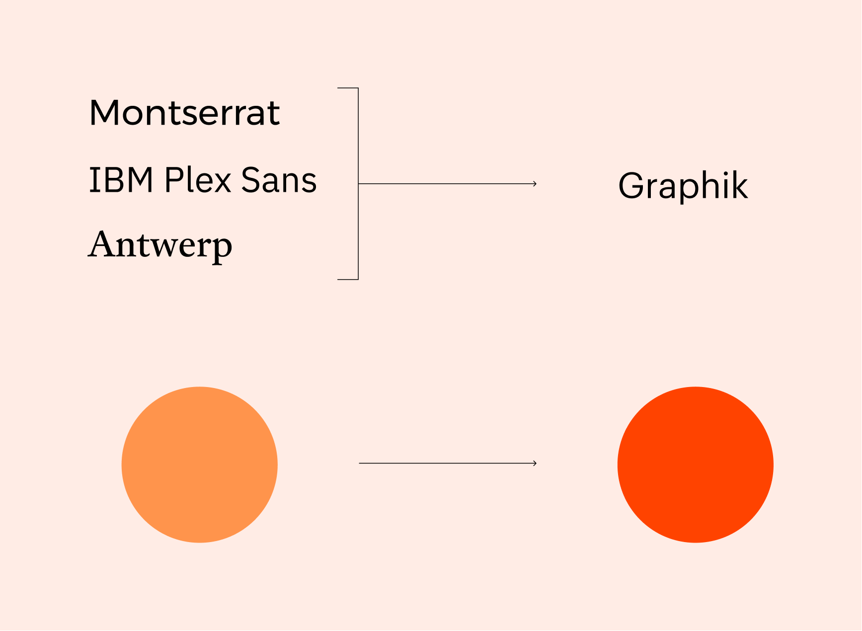
One of the main assets defined were typography and colour pallette. The previous typeface had some width and often we came across the spacing challenges, we have selected a typeface which has narrower width and high scanability as well as aligned defined brandcore.
The new orange and other sub-colours have better contrast with white background and present one of our core brand values — boldness.

Other case studies
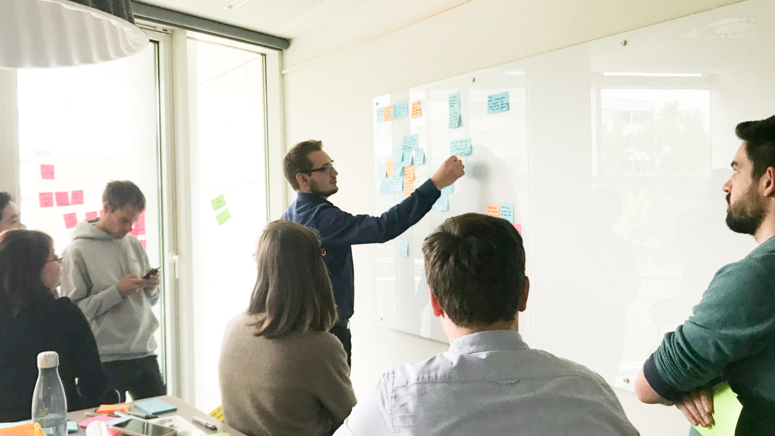
S&ST Design impactsDesign impacts for launching the platform
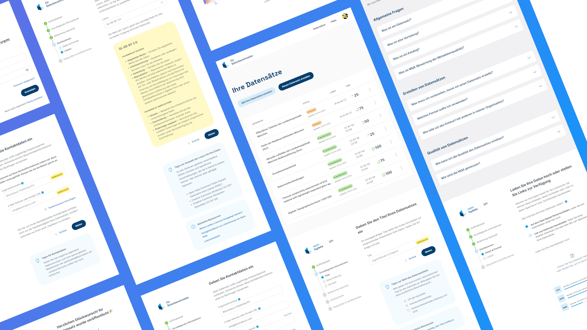
Bayern Open Data PlatformFrom complexity to simplicity: Enhancing data uploads for everyone

ArtXCloud Private viewPrivateview turned artwork sharing into a live sales workflow
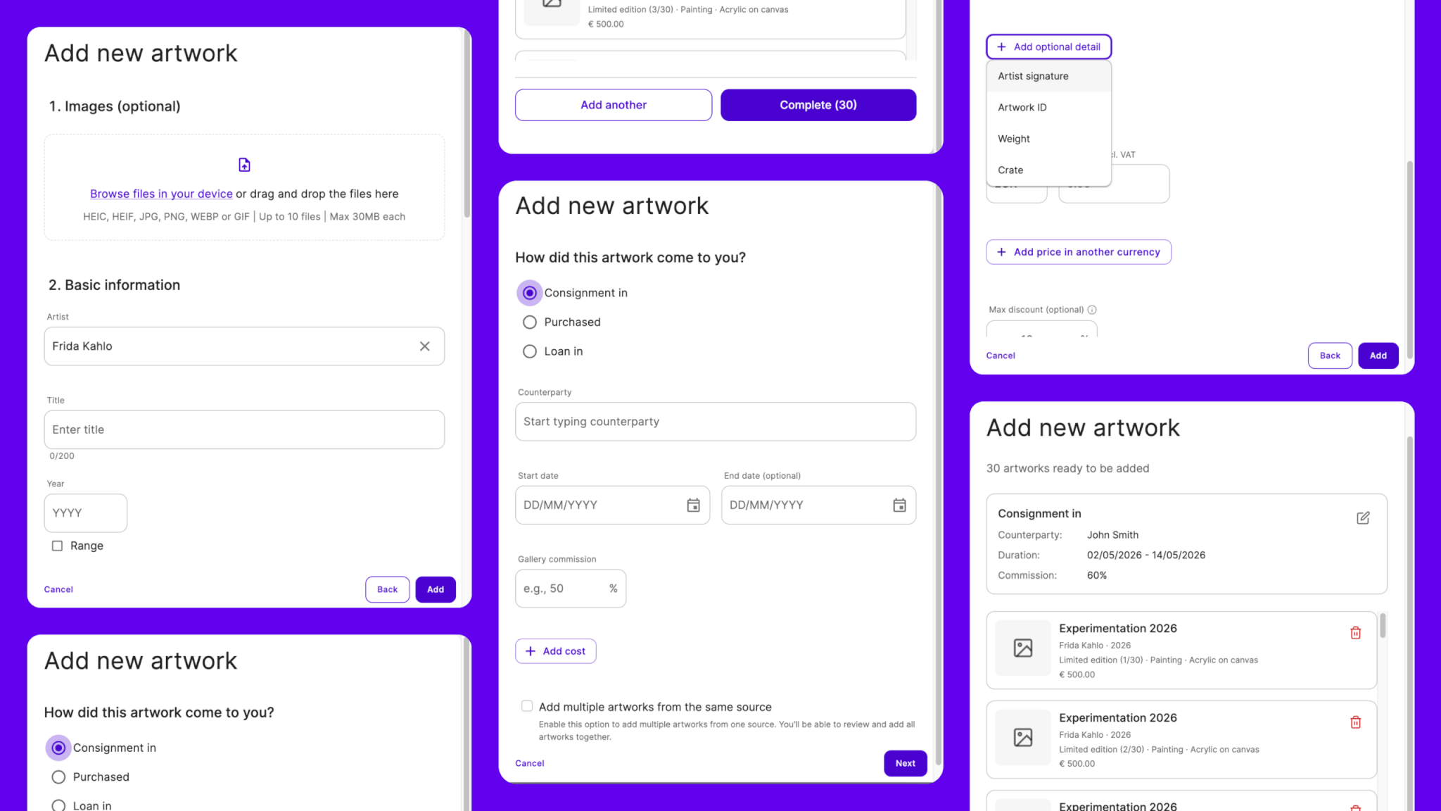
ArtXCloudReducing friction in artwork onboarding
PliantDesign summary of 2022

S&ST RebrandingGaining the recognition and the trust
DacadooNew generation of B2B healthcare platform

Porsche e-chargingDesigning interaction for the new e-charging device

QwiccFuture of urban EV charging experience
EquatexNext-gen equity participation platform