CASE STUDY
QWICC
Designing future of urban EV charging experience
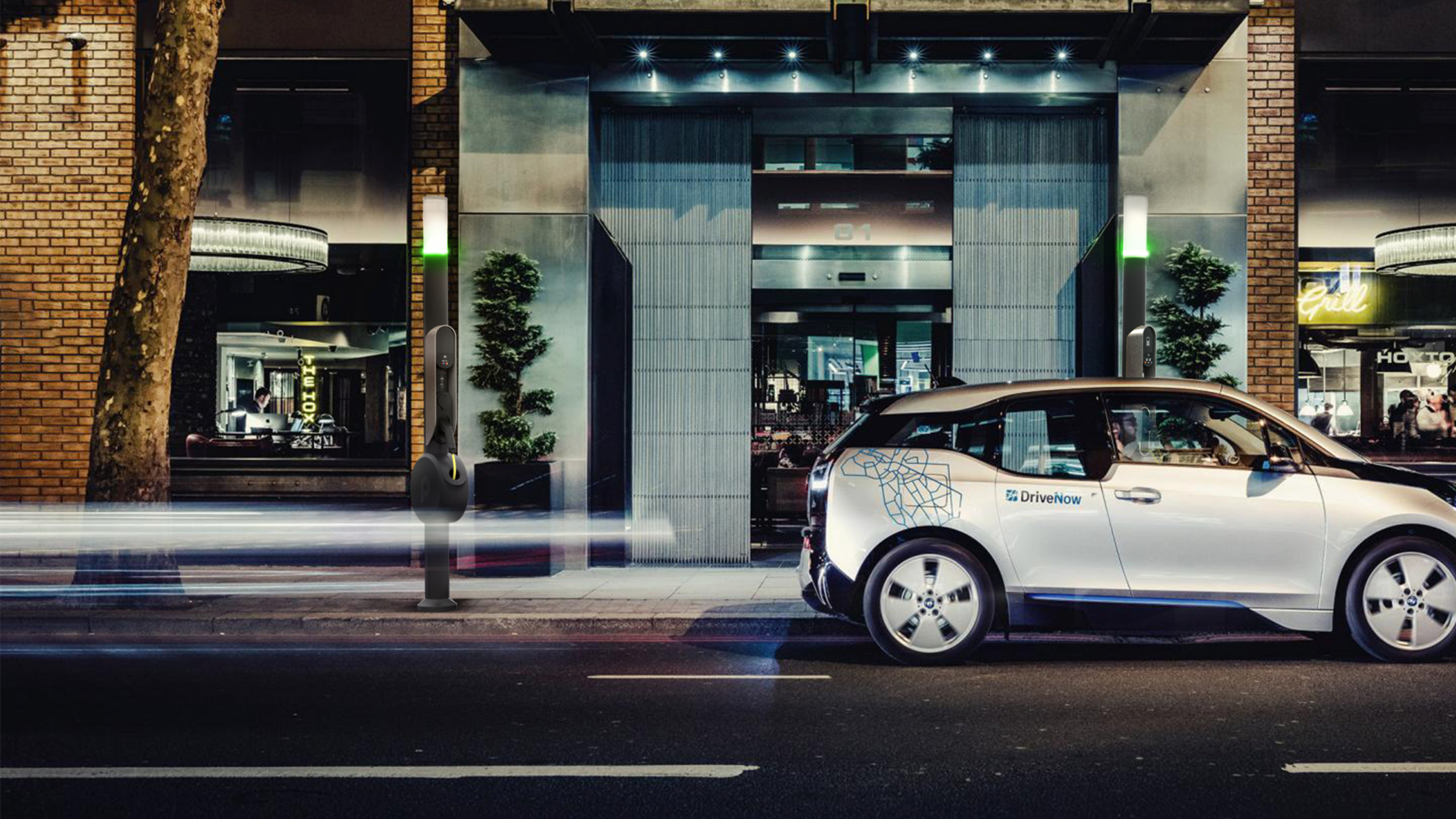
TIMING
Oct 2017 - Dec 2017 — 6 weeks
ROLE
Designing project activities and planning. Directing the team and reviewing the outcomes, as well as participating in design research.
OVERVIEW
Qwicc is a Munich-based start-up looking to disrupt the world of urban EV charging. The two founders approached us with a vision for an easy, convenient and reliable charging experience for private EV owners and car-sharing users. We built on this vision and create a concept that was technically viable yet ambitious. This was an effort across industrial design, service/product and brand design.
WHAT WE DID
- Design research
Service model design
Brand design
Charging station design
Mobile app design
WHAT WE DELIVERED
In a very short time frame of 6 weeks, we achieved a lot and created deliverables that support Qwicc going forward after the project.
1.
A " Story" deck
An animated Keynote deck that tells different user scenarios so Qwicc can communicate the concept after the program.
2.
Brand guidelines
A deck containing guidelines for logo usage, typography, animation and different templates for business cads, letterheads etc.. Also provided presentation templates as PPT files.
3.
Industrial design
CAD files and engineering files of the station concept.
4.
Service design
Flows and screens annotated in details to fully explain the experience both in the app and at the charging stations.
5.
App prototype
An InVision prototype of the concept app going through the main reservation flows.
6.
Tech assessment
A document giving advice and insights on technologies for data collection, parking detection and communication between devices.
3 BIG TAKE AWAYS
01. Charging station
02. Mobile app
03. Qwicc brand
01
Charging station
KEY INSIGHTS
We started the program with ‘guerrilla’ research sessions in different cities (Oslo, Stockholm, Munich, Madrid, Paris) to evaluate the current practices, opportunity areas and pain points.
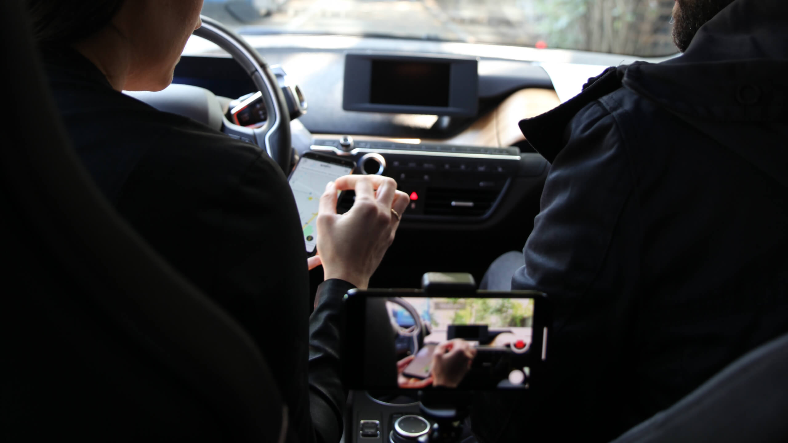
We also spent a day driving EVs in Munich, trying out charging stations and observing other users. We tried several apps to locate stations as well as the car HMI. From these experiences we’ve drawn out insights that helped us shape a simpler, smarter e-charging service.
Insight 01 — Cable Management
Cable solutions have to cleverly fit into a fast, hassle-free experience.
In the era of the all-wireless, cables must offer a smooth and secure way of charging the car.
Cable is long and users have to fight to reach the station.
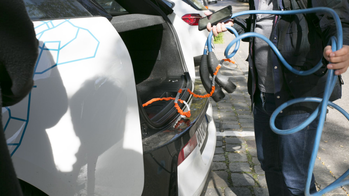
Personal cables adds 2 steps to users. Not user friendly especially with a phone in hand.

Cable is easily tangled, what is the best length?
Cable on station is easier but system has to be intuitive.
Insight 02 — Charging Environment
Parking and charging, fighting the same battle.
A lot of parking issues are also shared with the e-charging experience. The charging station need a comfortable environment to thrive in.

Integration in public space is key, Most of the time stations are barely noticeable.

“On the public one, you go for a 2-hour charge and then what? What do you do in the meantime? It’s only good for the parking facilities”.

The parking nightmare prevents EV bays to stay free.

Parking spaces are not designed for EV-charging stations.
Insight 03 — Maintanance & Protection
Charging stations need to be strong against city hazards.
Cities are unpredictable. Designing a robust station is key to avoid frequent maintenance.

In Milan, all stations are spray-painted & full of stickers.

Living outside means also faster damage.
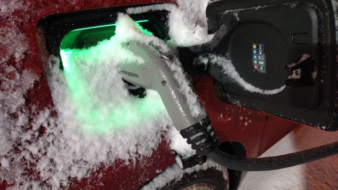
Weather conditions have to be taken into considerations.
Electric outlets should be protected from weather and vandalism.
Insight 04 — Finding the stations
Digital tools can be unreliable or unadapted to the situation.
We need to find the sweet spot for apps to be really pertinent in the overall e-charging journey.

Is an App relevant? App is convenient with a copilot.

Using while driving is dangerous.

Car HMI should be leveraged to list and guide stations.
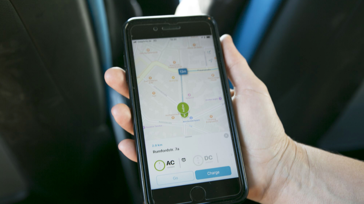
On 7 stations, we could only use 2. Others were either not existing, broken or extremely hard to find.
Insight 05 — Payment Method
Payment changed drastically from the fuel pump, sometimes for the worst.
Going against the “one card to rule them all”, charging networks are making it hard for the customers.

In Italy, DC and AC are combined. User Interface is pretty complex to handle.
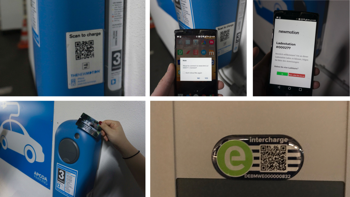
Payment methods are confusing.
Insight 06 — Product Usability
Usability standards are non-existent.
Charging stations are all using different patterns, making it confusing for customers to have a consistent experience.
A user could get off the station because he couldn't unlock the charger.
Fast login no hassle with app or whatsoever.

There is no language settings, how does a tourist do?

Too much info, text&screen. Lazy and go for the screen
Cumbersome and disconnected experience. Loads of step have to be done in a certain way.

Omni-directional: outlet on side, card reader in front…

All different!
01/Cable Management
How might we design an intuitive charging cable solution?
02/Charging Environment
How might we design an efficient charging station, including product and space altogether?
03/Maintenance & Protection
How do we design a safe and protected product for public usage?
04/Finding the Stations
How might we design digital interfaces that don’t add extra layers of complexity?
05/Payment Method
How do we create an intuitive and hassle-free payment/login system?
06/ Product Usability
How might we design the charging stations based on natural and existing behaviour?
BRAND POSITIONING
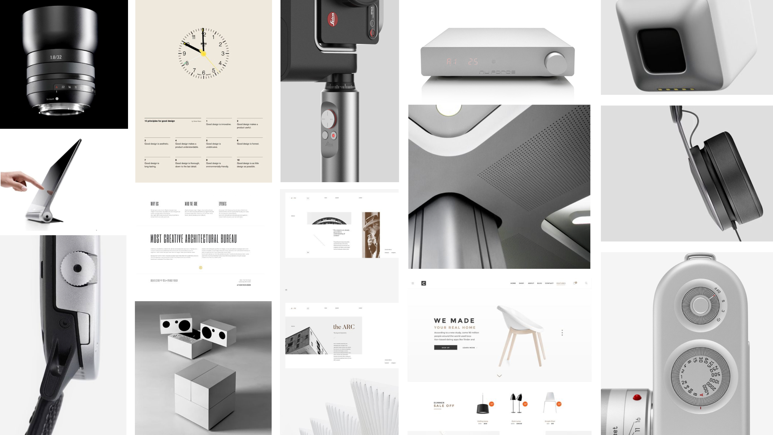
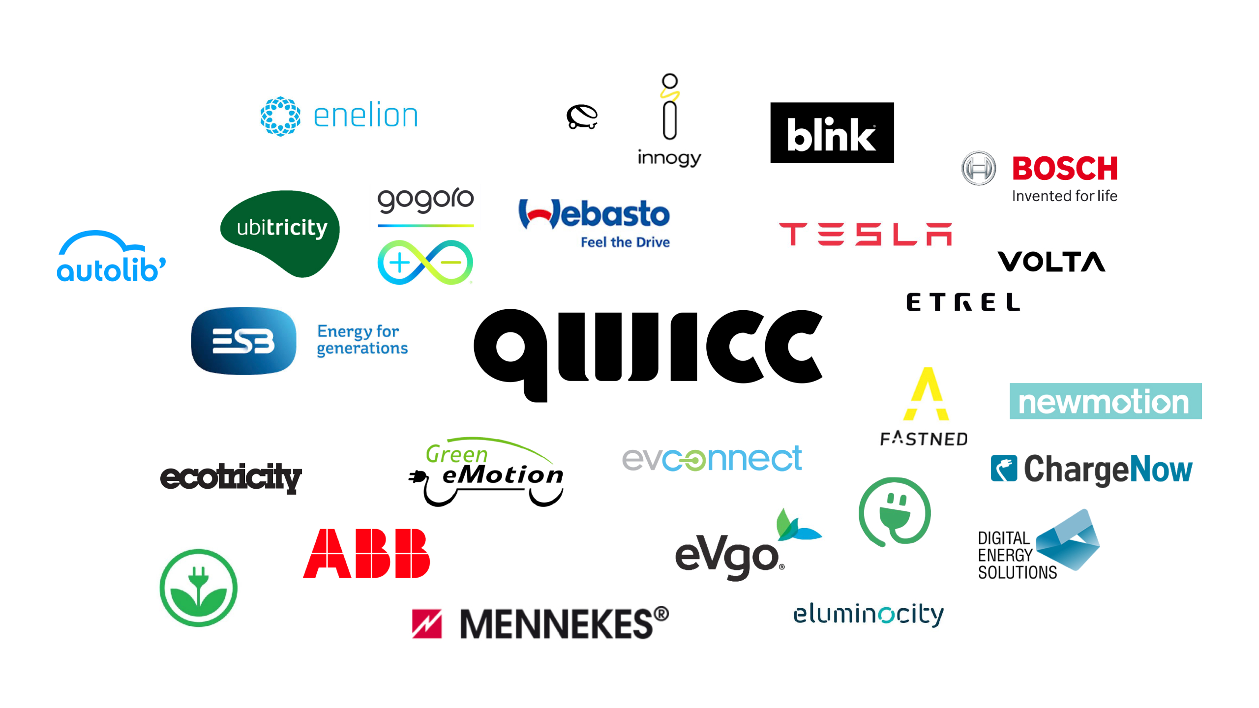
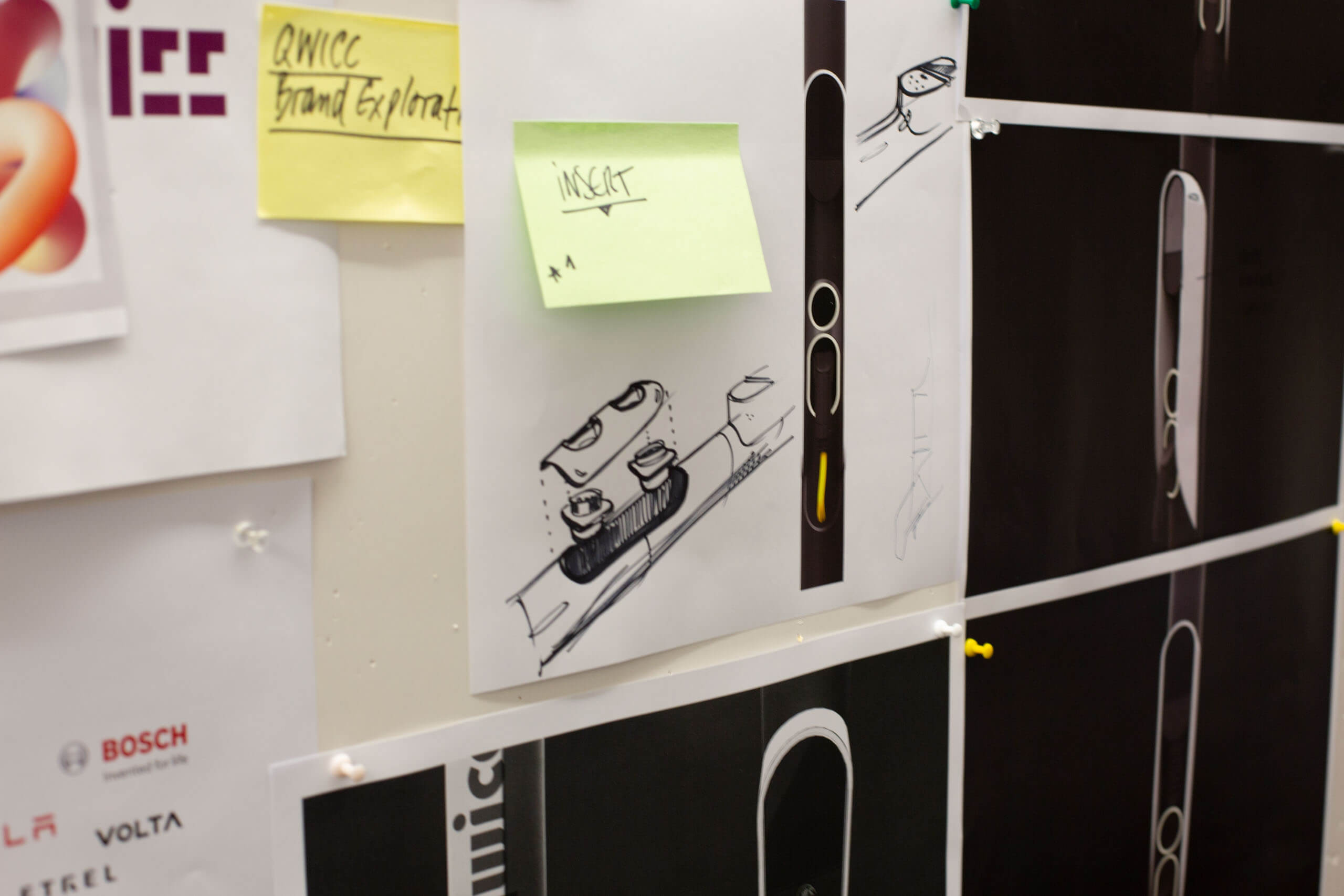
We conducted secondary desktop research to see the landscape of e-charging services and the design language of each player. With Qwicc founders, we identified the direction.
The final brand language is inspired by urban context yet minimal and functinal.


VISIBILITY
When cars are parked in front of the stations, sporting them can be really tricky. Especially while driving.

COMPLEX &
OVERWHELMING
All in boxy design tend to confuse users — "what should I do first?"

STYLING
Inspiration from simple wall-mounted chargers. Bring that spirit to the public urban context.


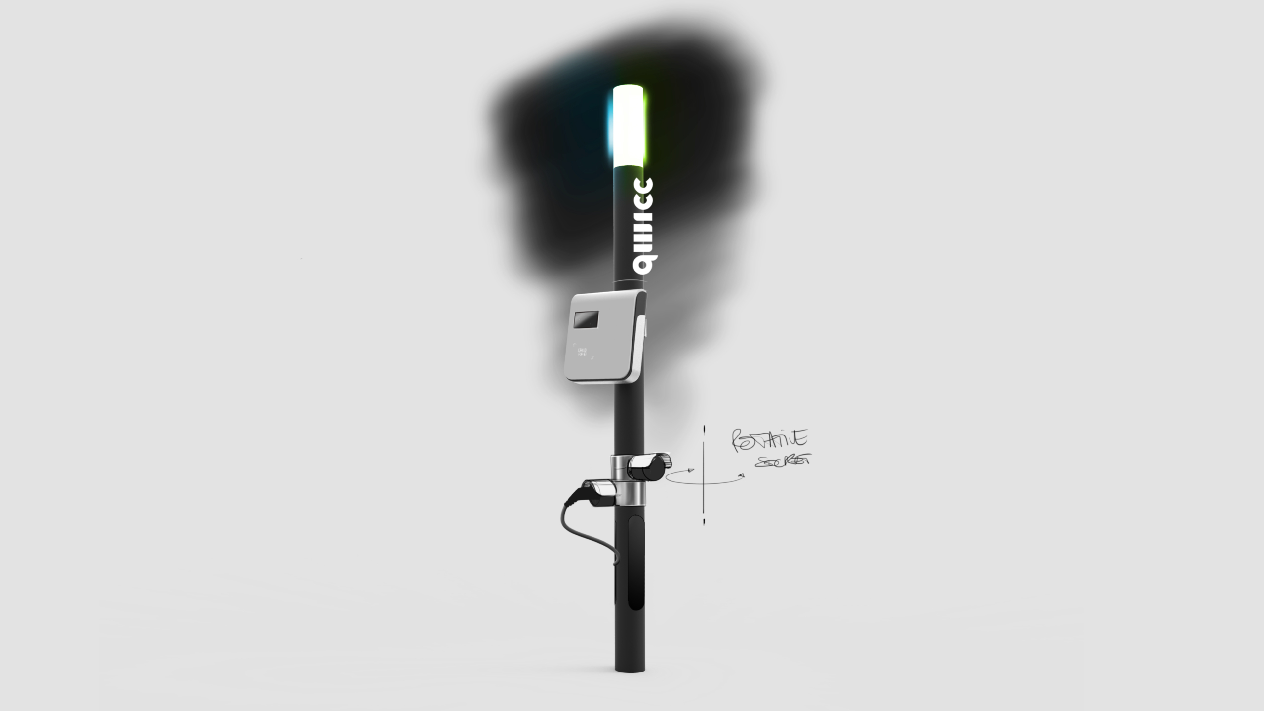
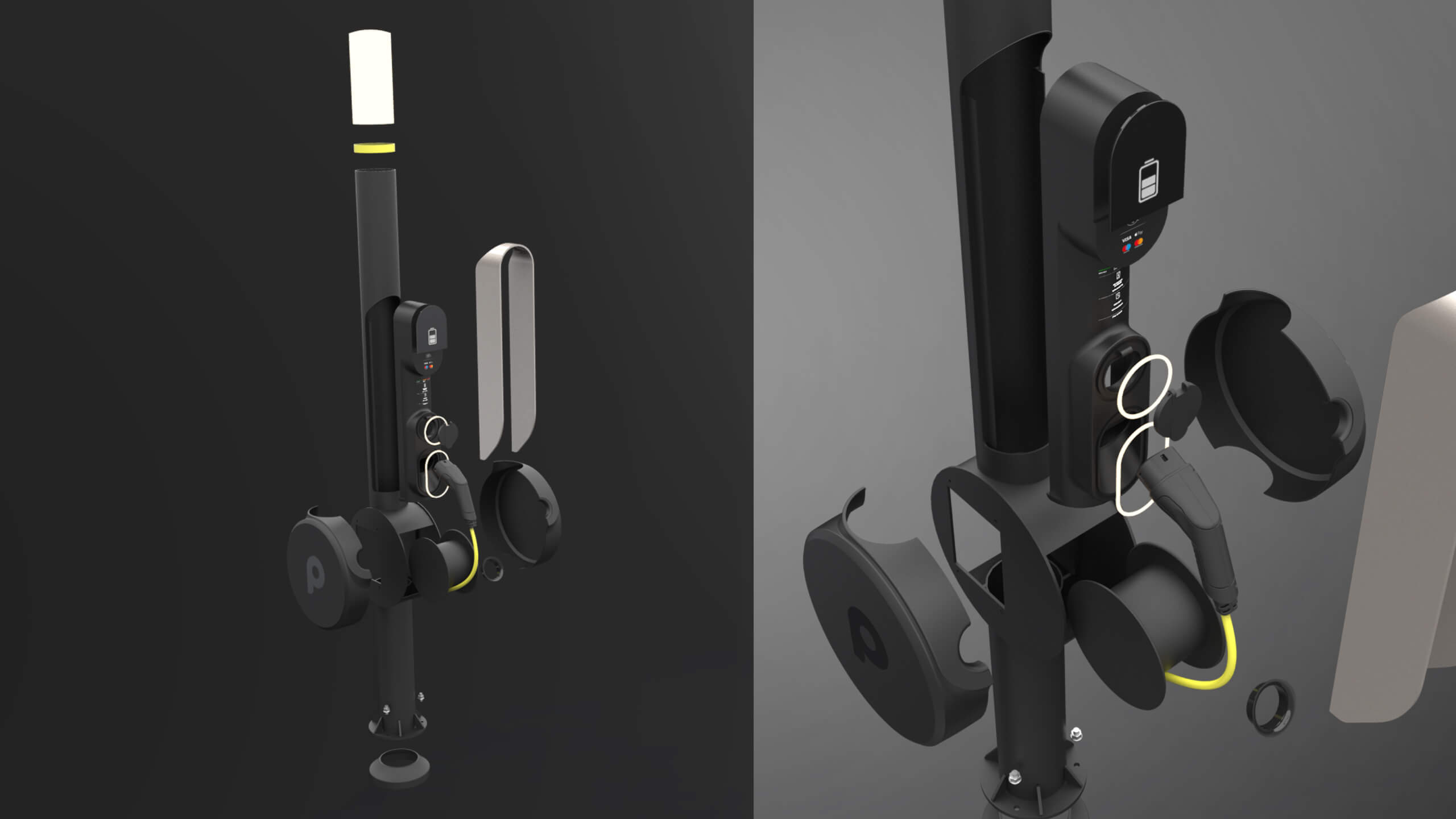
CONCEPT POLE DECONSTRUCTED
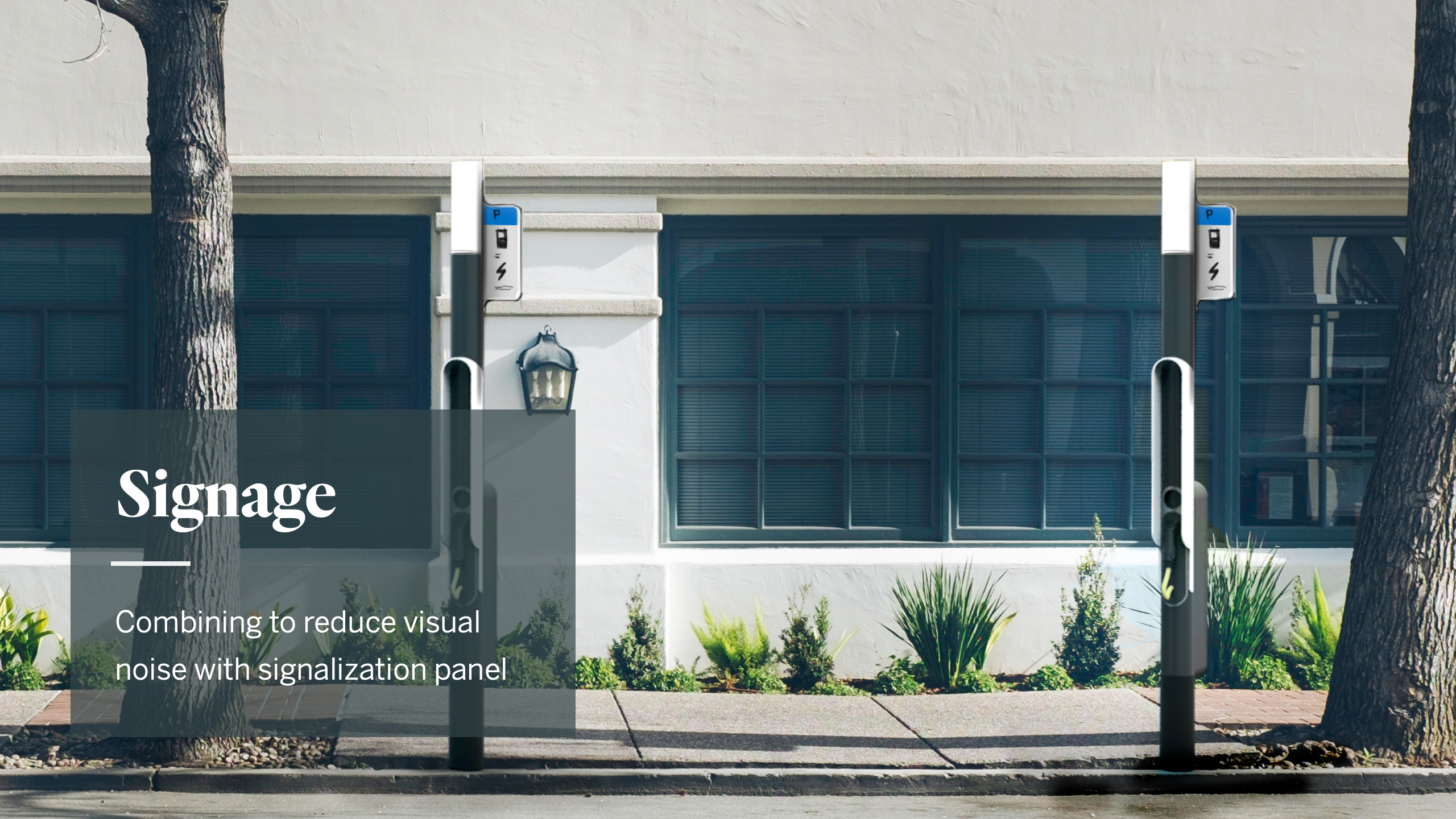
- Great visibility
- Creates an iconic silhouette
- A long-lasting design blending in with city landscape
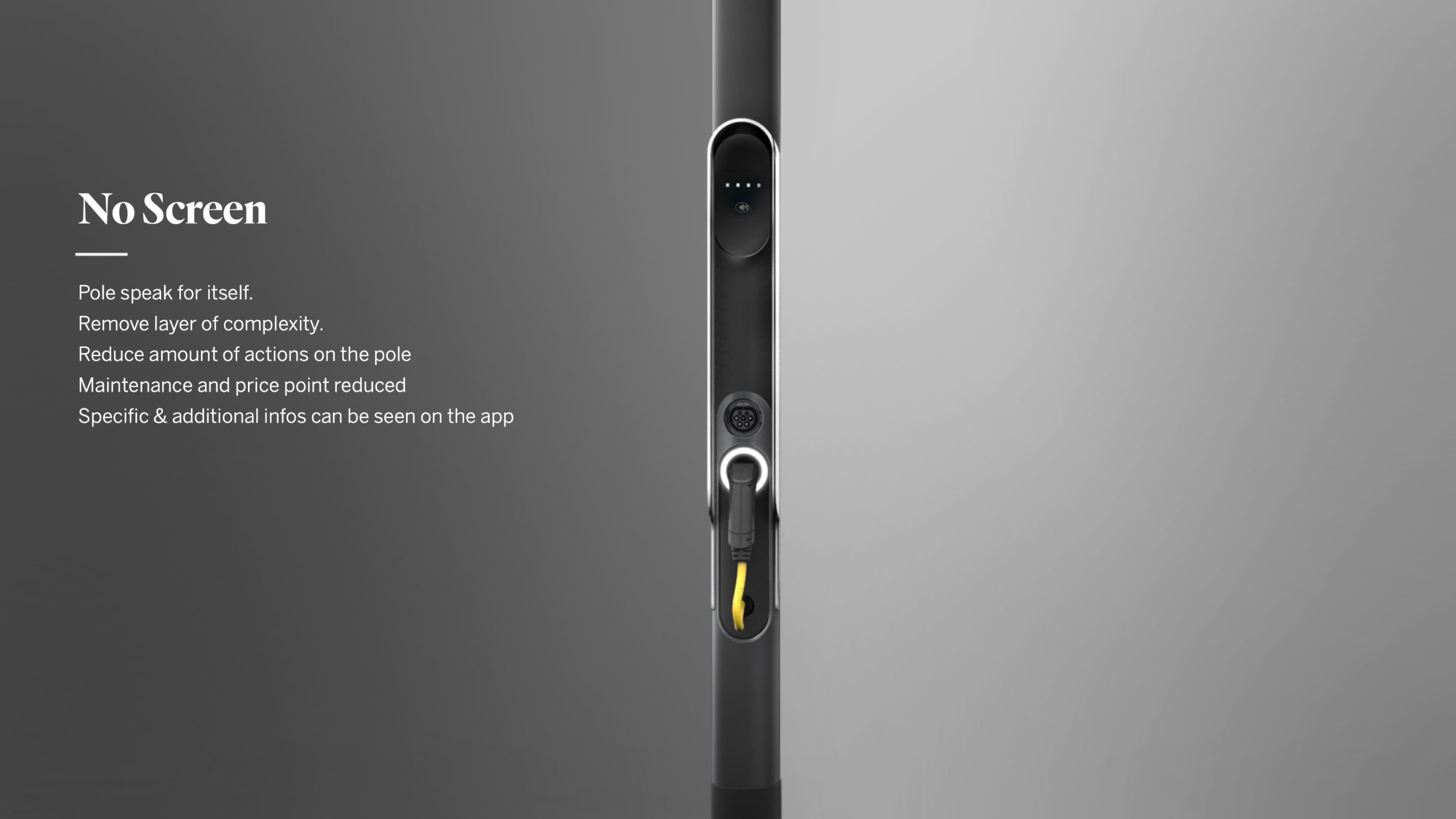
- Clear affordance and simple functionality
- Modular and ready for future evolution
- Cost-efficient


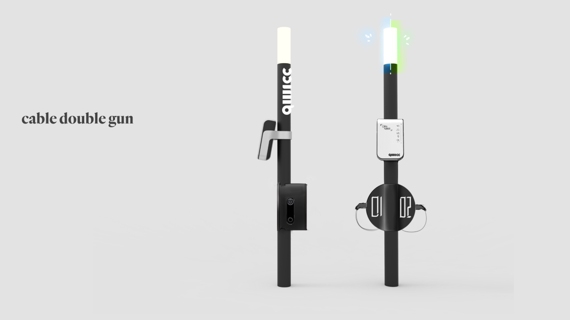


CONCEPT ITERATION
Concept design went through a few variations and versions for refinement while prototyped, tested and having a discussion with the technology manufacturers.





VR & AR FOR DESIGN
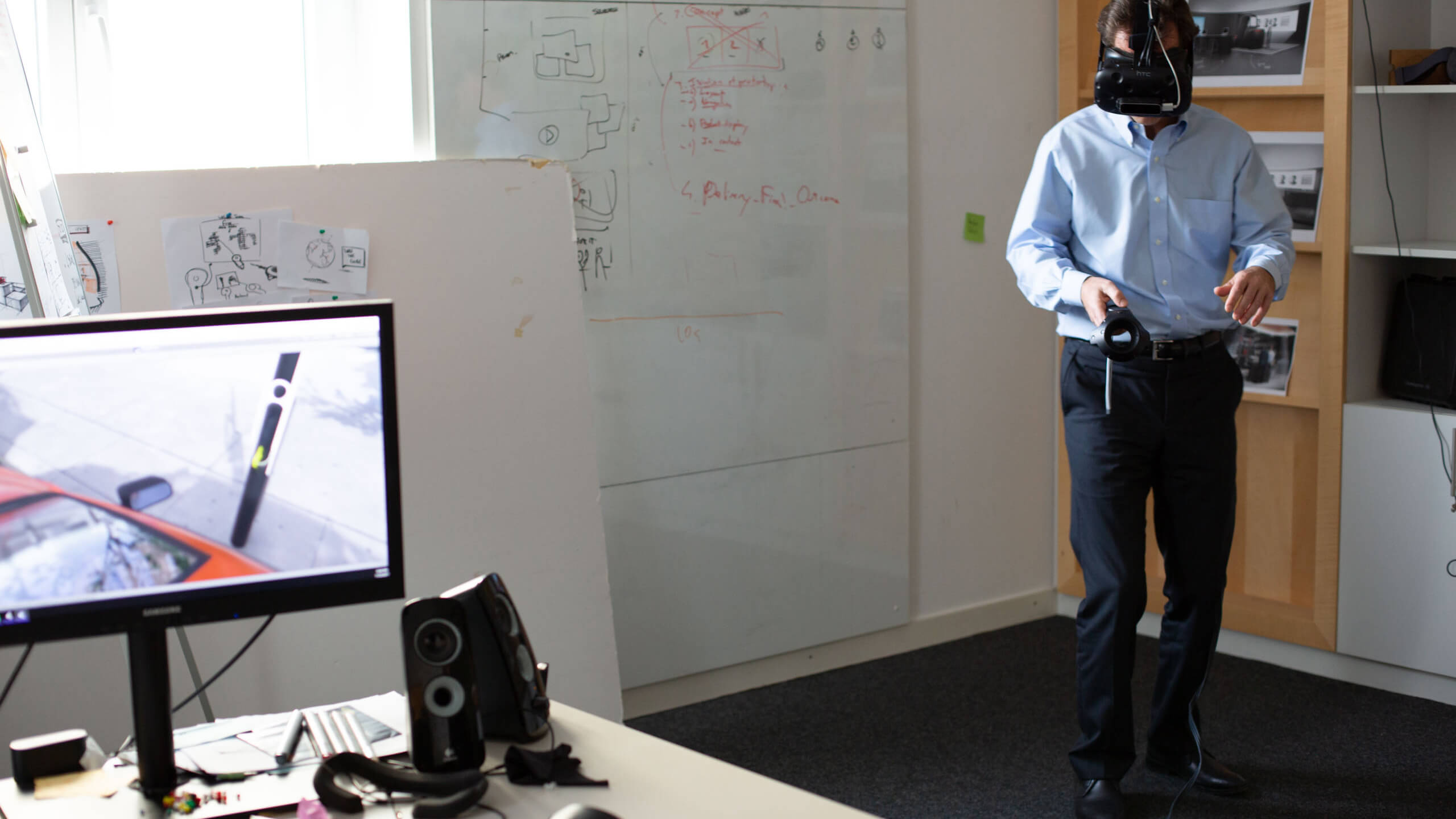
We built a virtual reality simulation of the charging station in a street to verify the usability of the design (e.g. height of the gun, space between the car and the station, visibility in an environment). These visual tools enabled us to influence the design process and also equipped the client with a powerful to pitch.

ICONIC CHARGING STATION
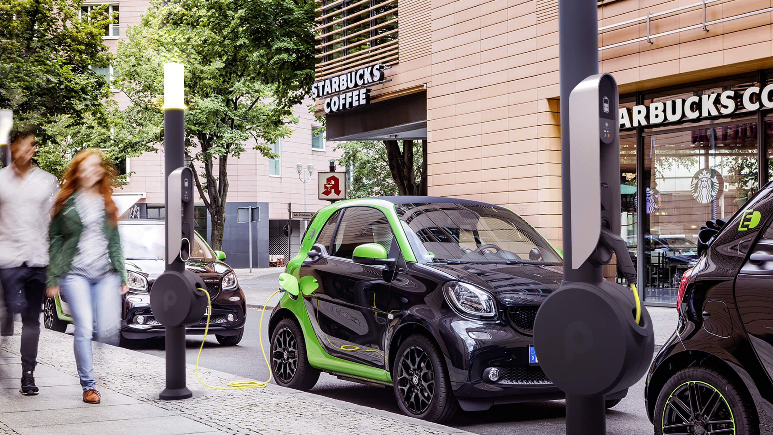
Localisation, reservation and easy use are the main topics of the charging experience. Most of the existing chargers are hidden by parking cars, not integrated in the environment and complicated in use.
Frog developed an iconic charging pole that is easy to localise because of the hight and the status lights on top of the pole. Easy to use because of the clear structure and design of the interaction areas and touchpoints and with a slim and dark appearance very well integrated into the environment.
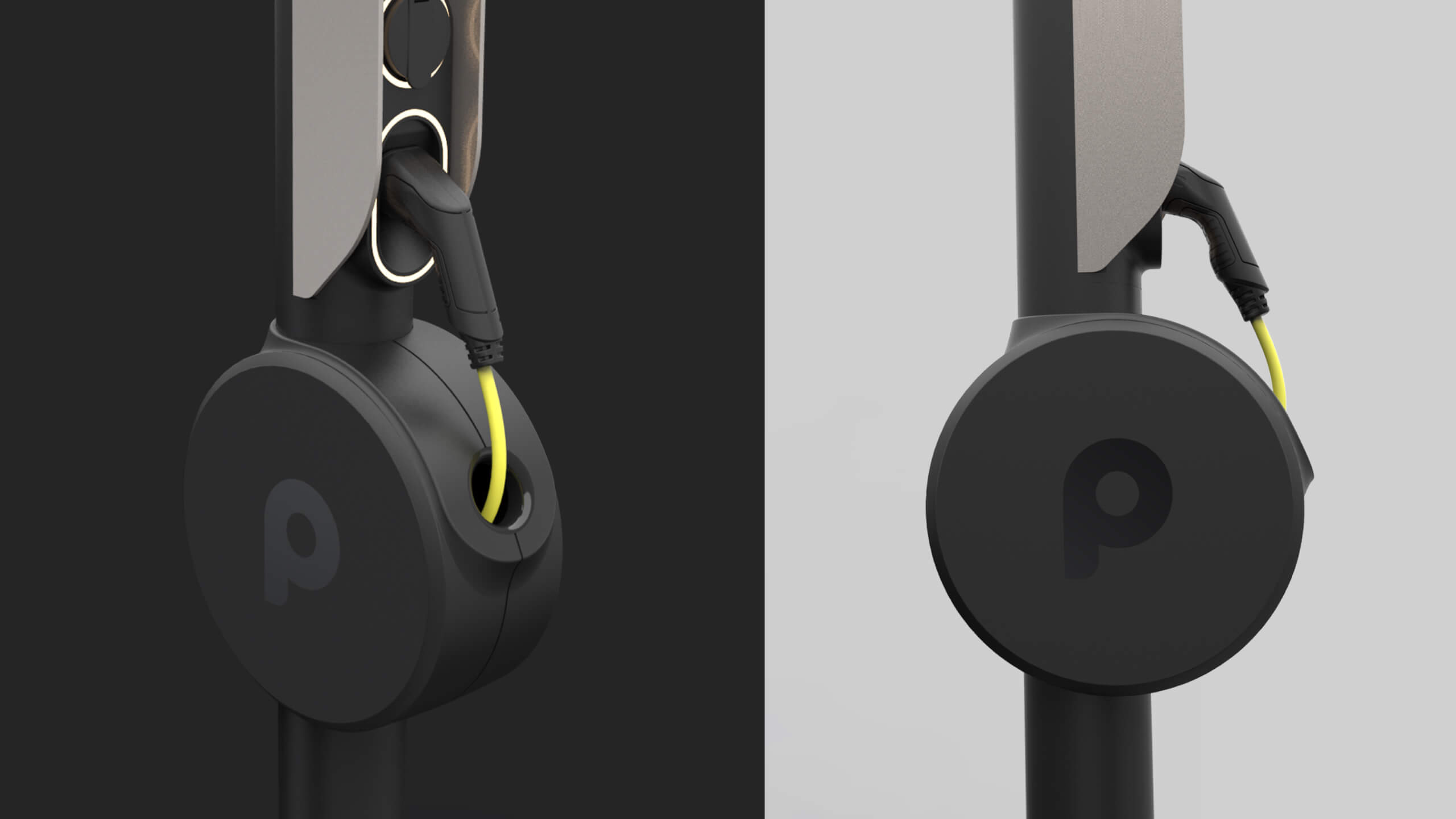
The AC charging pole has an integrated 5m 11KW retractable cable with a Type 2 connector and a 22 KW Type 2 socket. The pole can be easily detached and exchanged for maintenance reasons.


02
Mobile app
SERVICE DESIGN
Before diving into designing user flows and UI, a service/business model was created. Based on the competitive landscape and reflecting insights from the field-research.
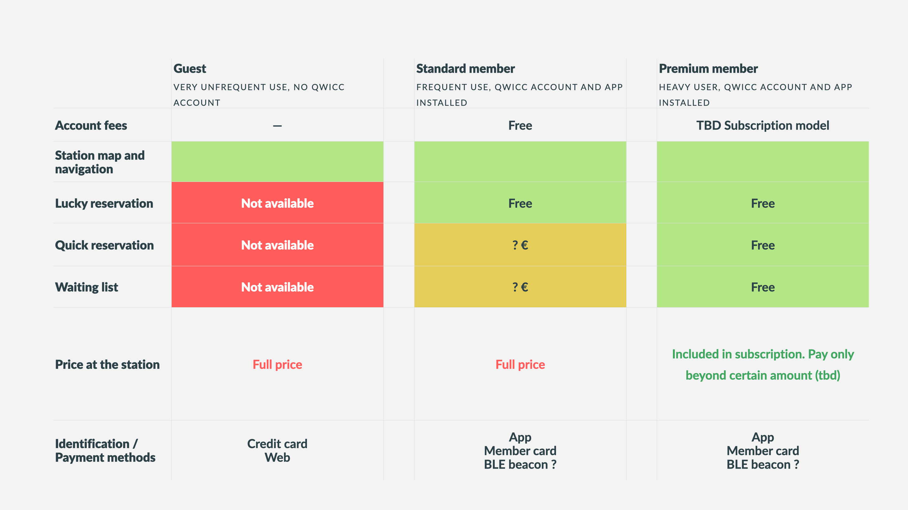
To avoid cluttering the use of the service and have too many points unused because reserved, we came up with three concepts of reservation.
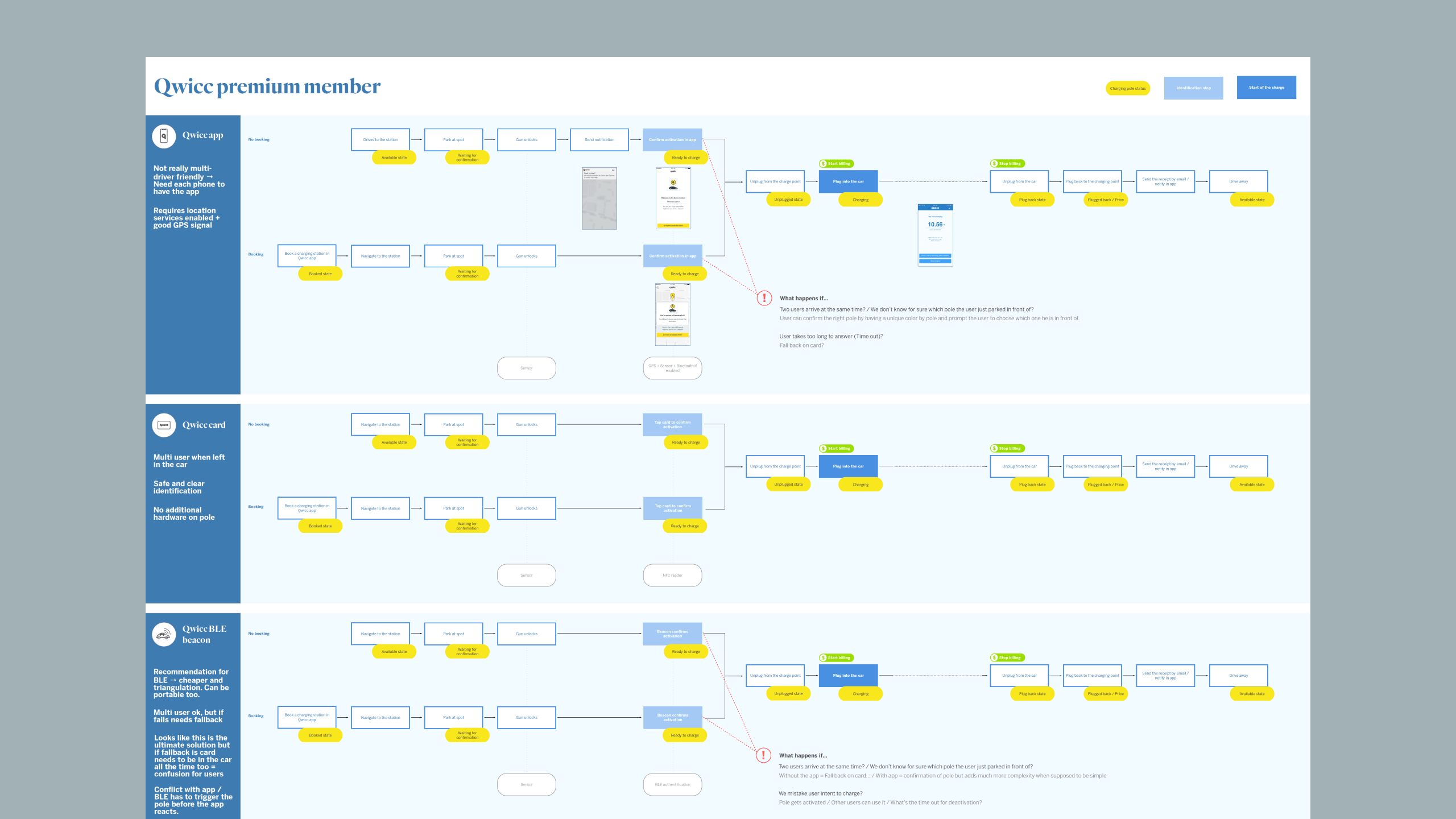
Different types of booking and procedures were mapped to 2 levels of membership and non-member.

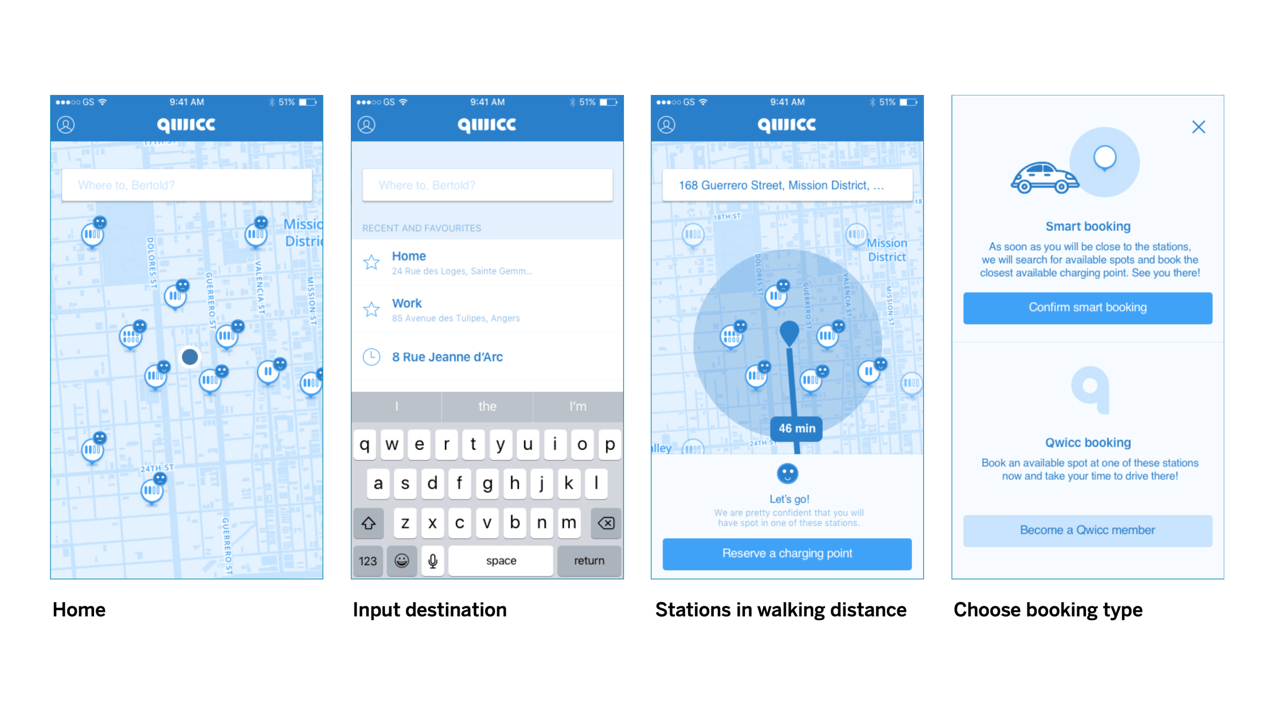
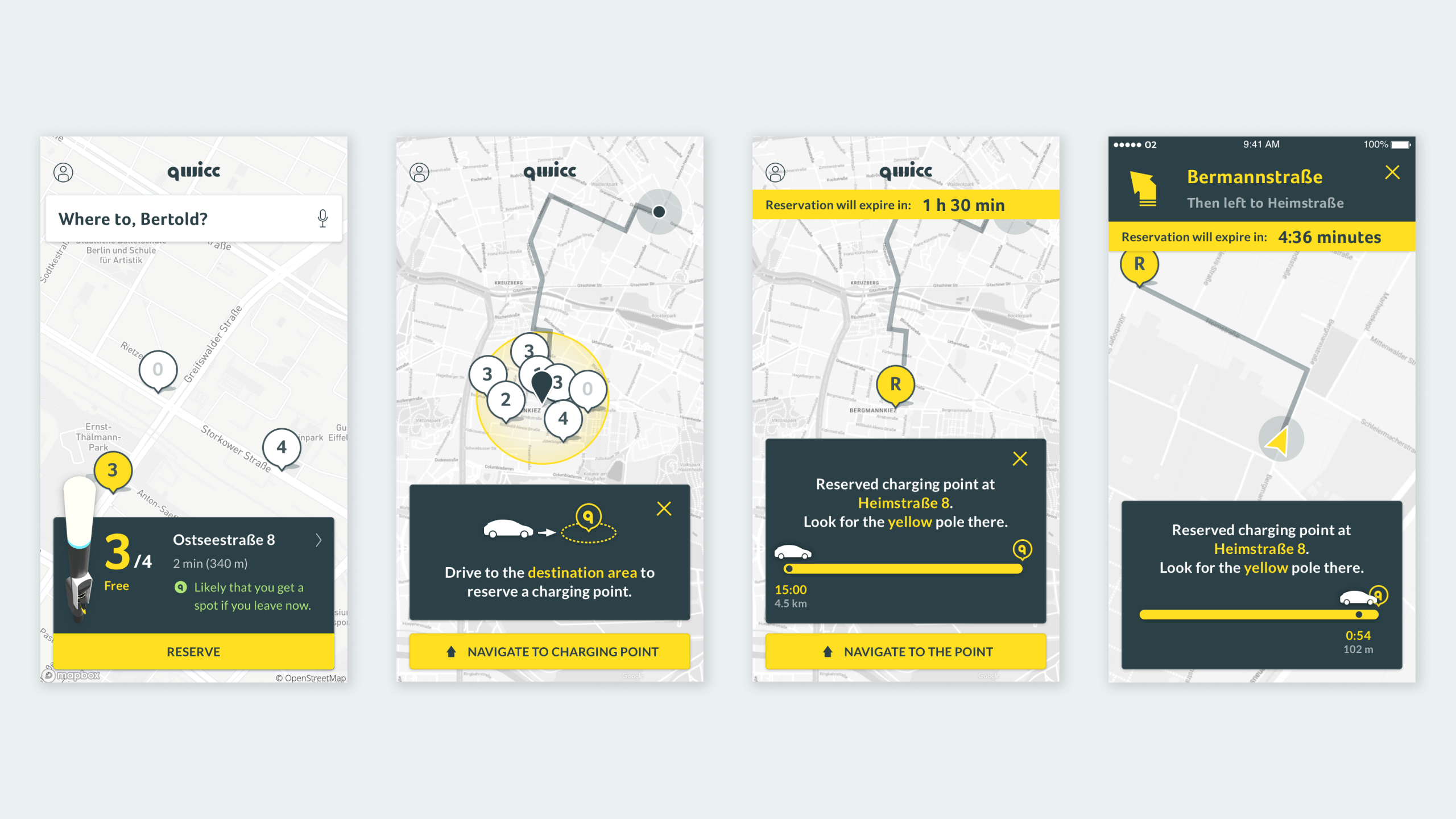
With Lucky reservation, users provide the final destination and they need to get in a 15-minutes geofenced area (that also depends on the traffic situation) in order to confirm the reservation. The exact station will be communicated together with the confirmation.

Qwicc reservation allows users to reserve an available charging point instantly.

Users can join the waiting list for any stations if they wish to get a charging point as soon as it gets available. This is the equivalent of a delayed Qwicc reservation.
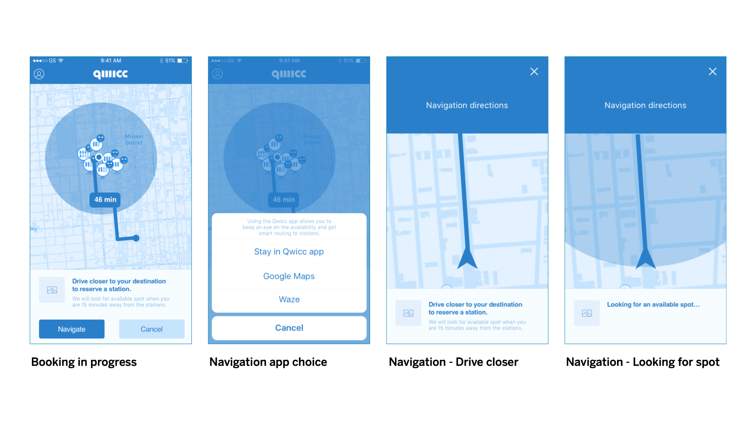

USER FLOWS
We mapped out user journeys and user flows for different users (guest vs members) using different touch-points (member card, app, credit card, etc), always aiming for ease-of-use in the context of challenging urban parking and urban infrastructure.

THE QWICC APP
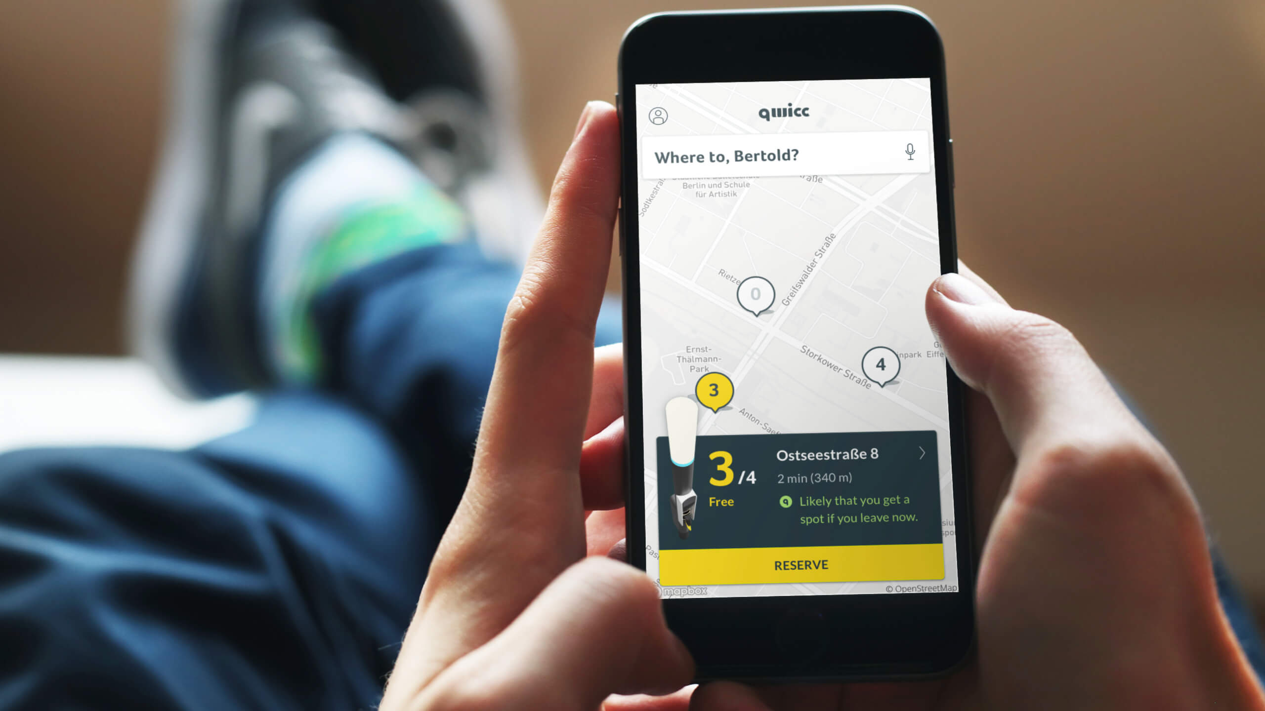
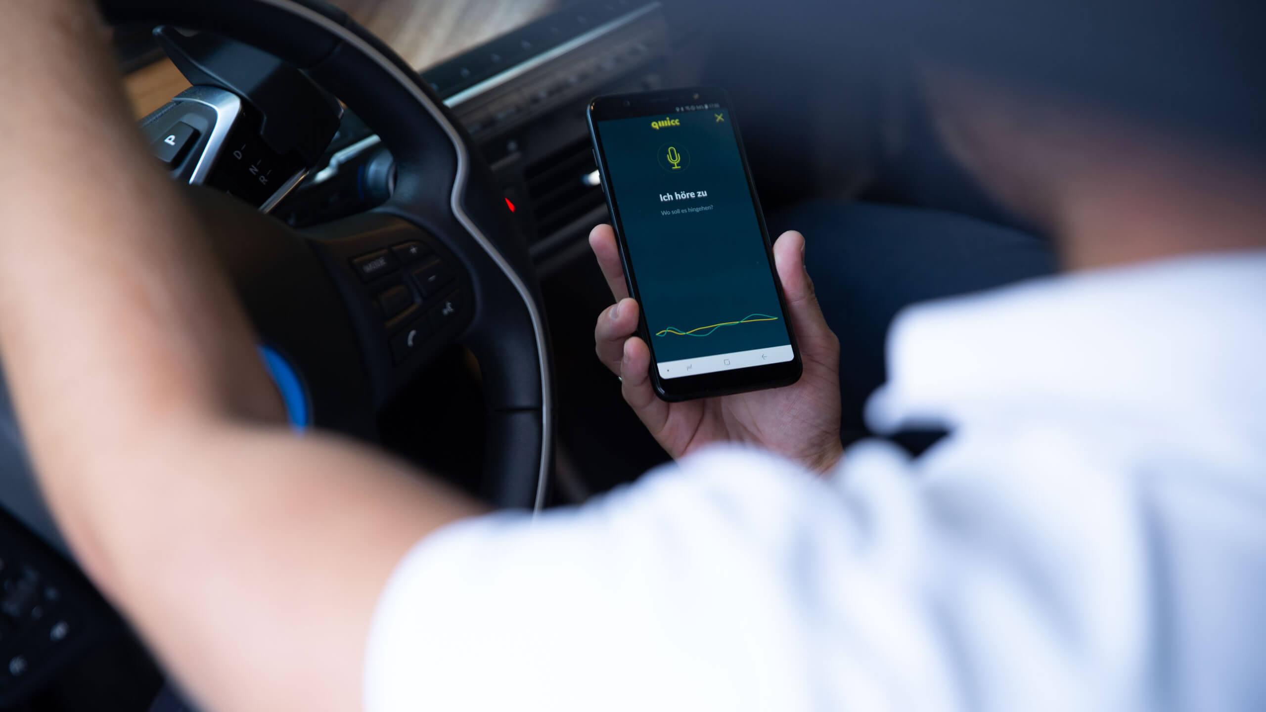
The Qwicc app is aimed at providing Qwicc regular users with an easy-to-use, valuable tool to use the service. Main features include: reserving a station, navigating to it and automatically unlocking/paying for the usage.


PAYMENT METHODS
We made story movies to present the Qwicc concept. It focusses on the experience at the charging point following different payment and identification methods. The one below is a story for "Qwicc member with the Qwicc card".
STATION UI LANGUAGE
The charging stations need to clearly reflect their status and guide the user throughout the experience. We designed a specific and memorable language to provide accurate and visible feedback along the user journey - for all touchpoints.

03
QWICC BRAND
BRAND IDENTITY
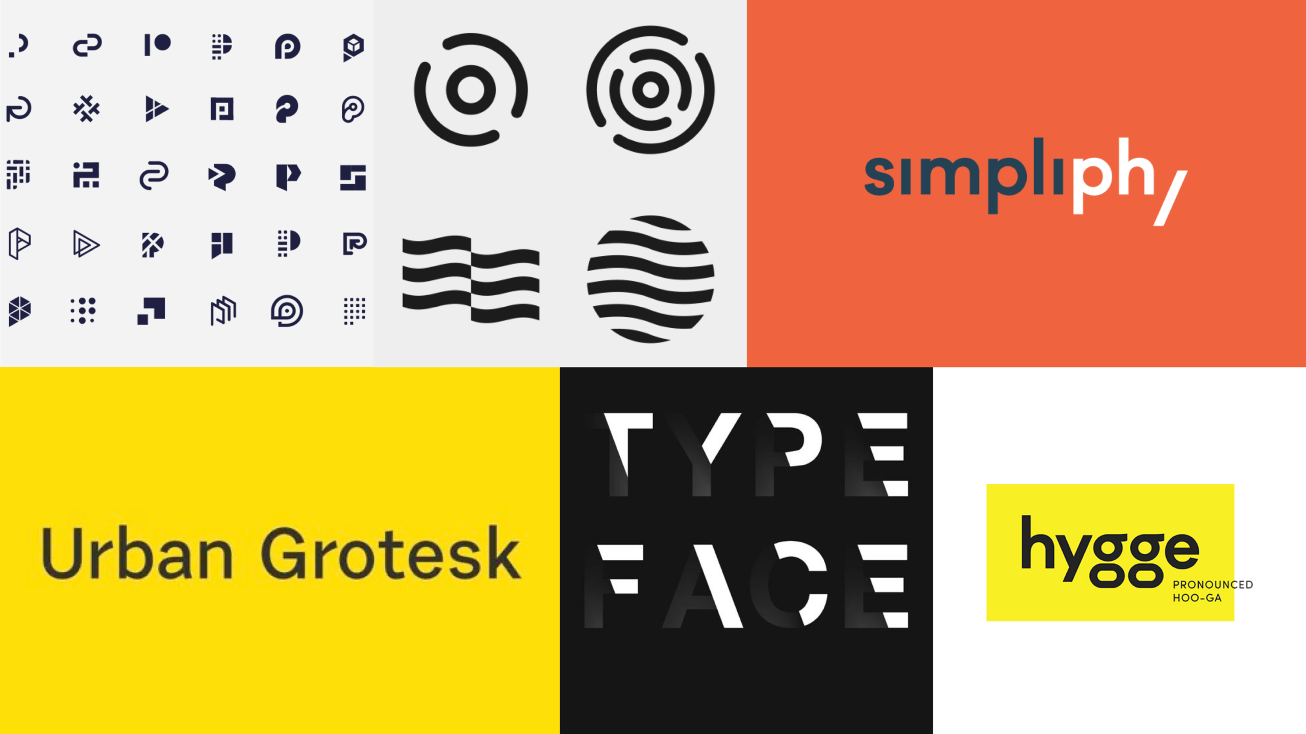
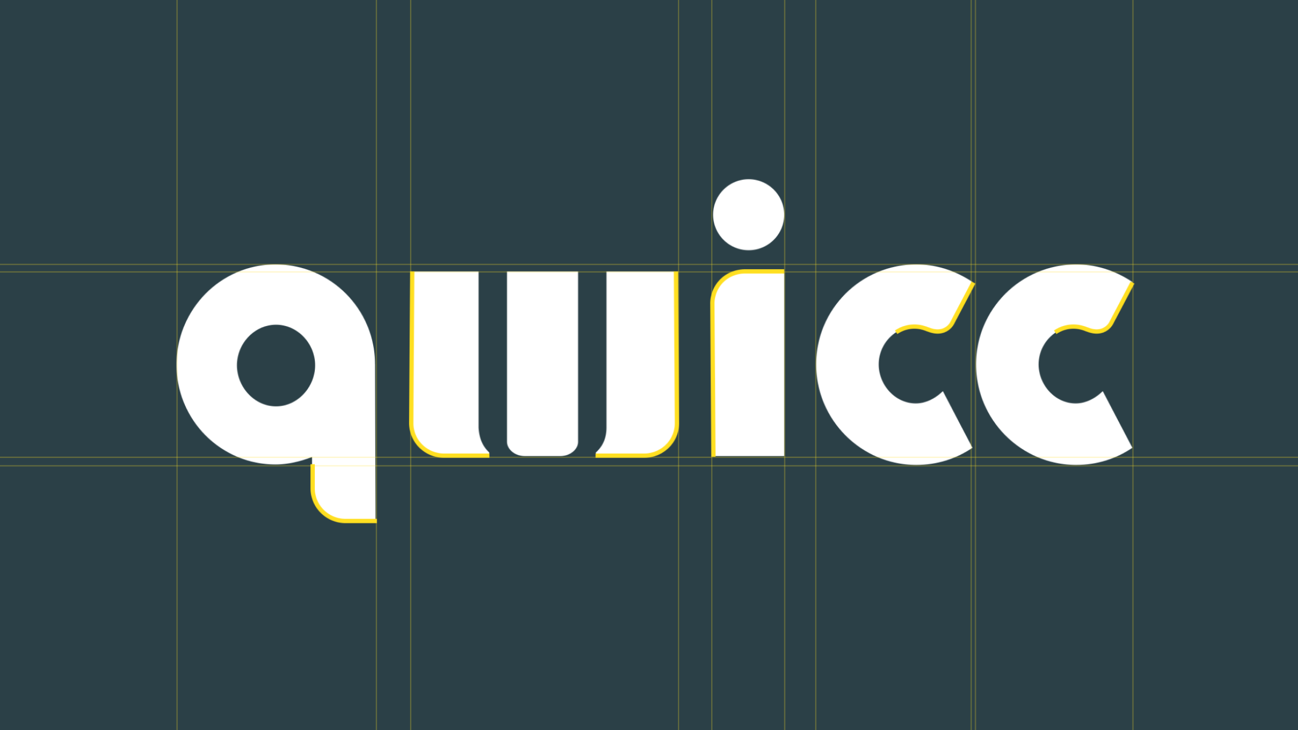
The logotype and the brand language were designed with inspiration from the context of the Qwicc service — urban mobility.
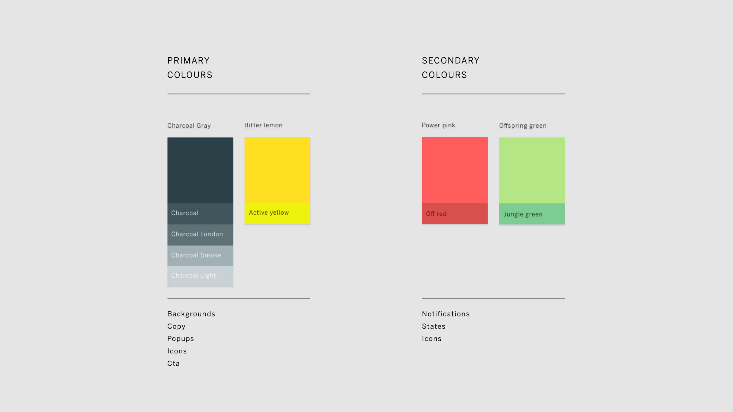
We designed the Qwicc brand to be fresh, approachable and ‘future-proof’. The yellow colour represents a call to action and will be applied for booked/in-use states across Qwicc touch-points. The logo is inspired by the service itself and has a strong presence throughout the experience.






USER TESTING
After this project, they released the beta and came back for a small project for usability testing in October 2018. Now the product is launched in the market. Their brand name has changed to "Qwello". Working for design consultancies often comes with the frustration of not having any control after the end of projects so it's really a great feeling to see the service and the product designed in the market.


TEAM
Barbara Link — Program Manager
Benjamin Gracci Krogel — Visual Designer
Bertold Engler — Product Engineer
Guillaume Descamps — Industrial Designer
Hira Verick — Executive Creative Director
Jens Wiemann — Visual Designer
Matthias Mouchard — Interaction Designer
Pier Paolo Orioli — Design Technologist



Other case studies
S&ST Design impactsDesign impacts for launching the platform
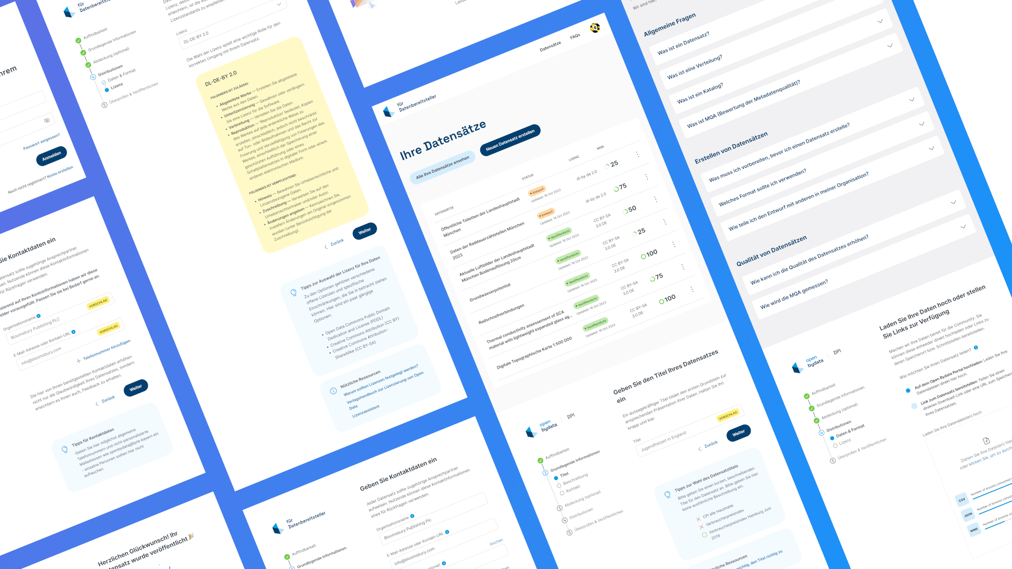
Bayern Open Data PlatformFrom complexity to simplicity: Enhancing data uploads for everyone

ArtXCloud Private viewPrivateview turned artwork sharing into a live sales workflow
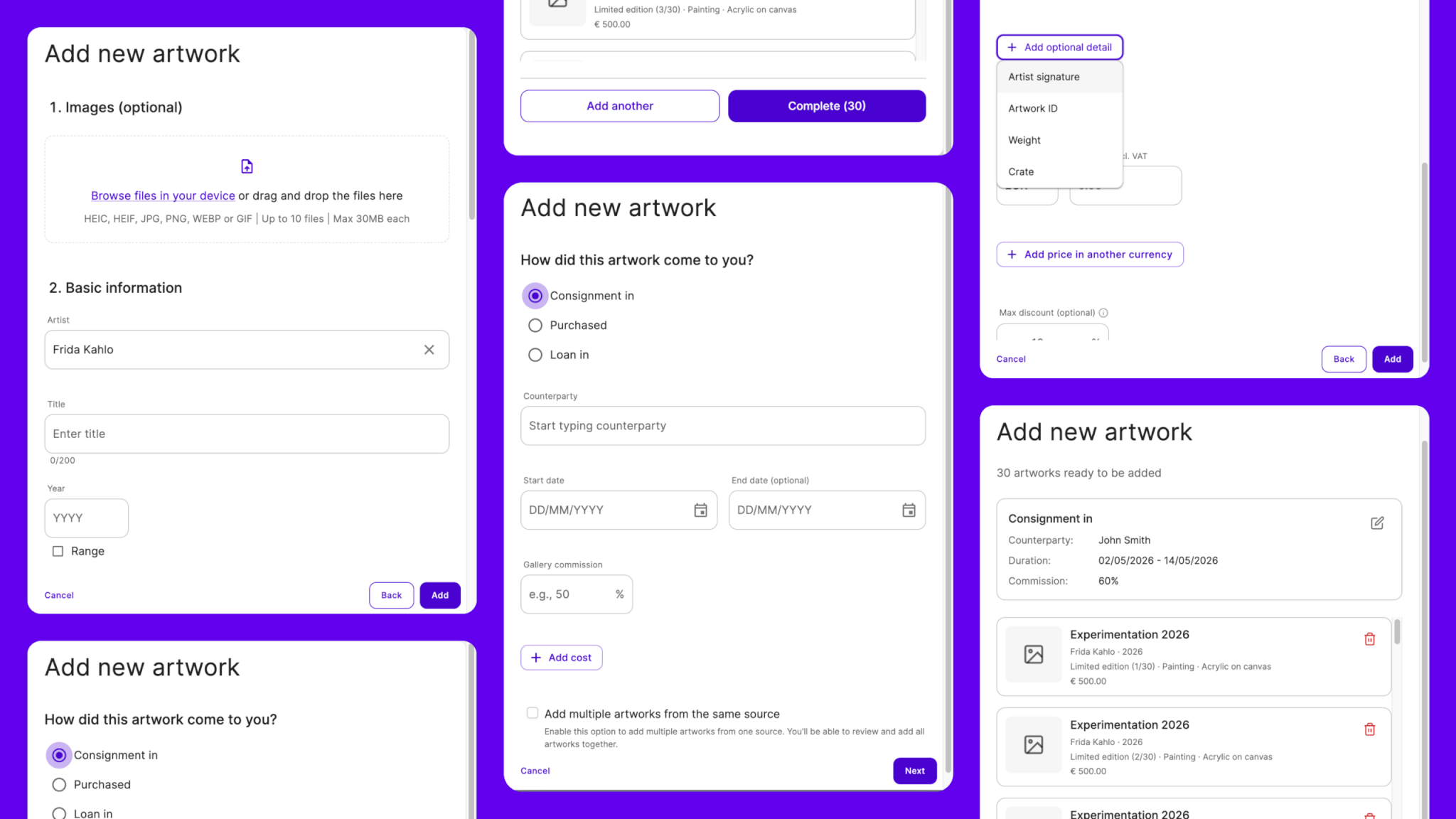
ArtXCloudReducing friction in artwork onboarding
PliantDesign summary of 2022
S&ST Company websitePowering the next stage of growth

S&ST RebrandingGaining the recognition and the trust
DacadooNew generation of B2B healthcare platform
Porsche e-chargingDesigning interaction for the new e-charging device
EquatexNext-gen equity participation platform