CASE STUDY
SECURITY & SAFETY THINGS
Gaining the recognition and the trust

OVERVIEW
A brand is like a person, in how it shows up in the world and builds relationships with its audiences.
Defining who we are as a company and what we stand for, gives us a great opportunity to really stand apart from our competitors in the market.
Based on many conversations with the leadership and employees of S&ST we have defined the personality of our brand.
Additionally, visual & verbal communication has been defined and a brand book was created.
WHAT WE DID
- Stakeholder interviews & workshops
- Brand-core definition
- Logo design
- Visual & verbal language definition
- Guideline creation
3 BIG TAKE AWAYS
01. Defining the personality of our brand
02. Conveying the brand personality through voice
03. Communicating the brand through visual assets
01
Defining the personality of our brand
BRAND STAR
Our personality is defined by five traits. Expressions of our brand should ideally encompass all five of them, but it is not always possible to dial up all five traits. But it is critical to never do anything that goes against any of them.
Bringing our brand to life is about being cohesive across the experience not necessarily perfectly consistent.


02
Conveying the brand personality through voice
TONE OF VOICE
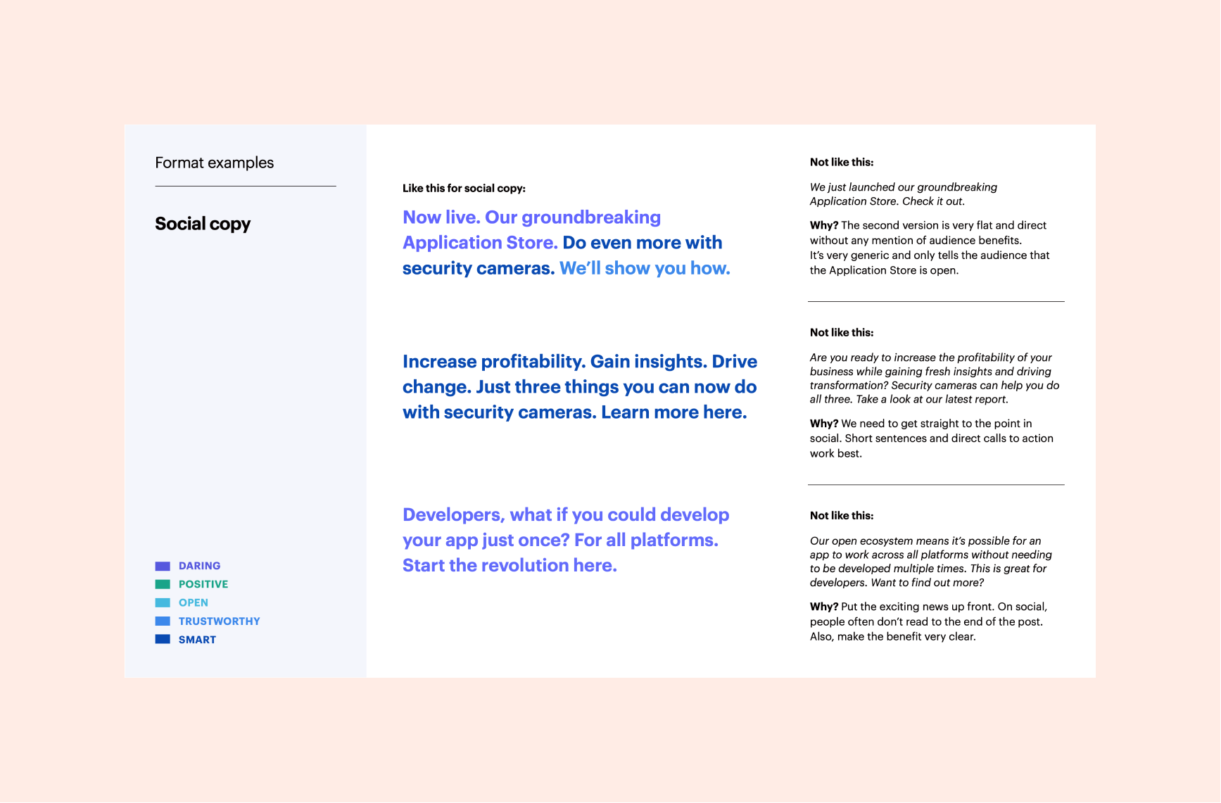
Our messaging expresses our brand’s essence, signalling who we are and what we stand for.
If we do this consistently, it will create the feeling: “that sounds like Security & Safety Things.”
Additionally, we have also defined a glossary and a style guide for copy writing.


03
Communicating the brand through visual assets
VISUAL PRINCIPLES
Our visual appearance is built around the enduring qualities of our brand personality: daring, positive, open, smart and trustworthy.

BRAND NEW LOGO
Our updated logo will help to make our brand more legible and more recognizable — in all sizes and in all contexts. Our logo mark is inspired by the round shape of a camera lens and can represent the hardware side of our ecosystem.
Parts coming together, apps being added to a device, partners collaborating parts to a bigger picture — the mark can stand for the openness and flexibility of our platform.



VISUAL GUIDELINE
We updated our brand colors for better usability, while keeping the overall intention the same.
“Graphik” is our brand typeface. The low contrast and large x-height give the typeface great versatility. It is suitable for display purposes as well as
for text sizes.
Our illustration style is well established, and its vibrant colors represent the innovative and daring nature of our brand.
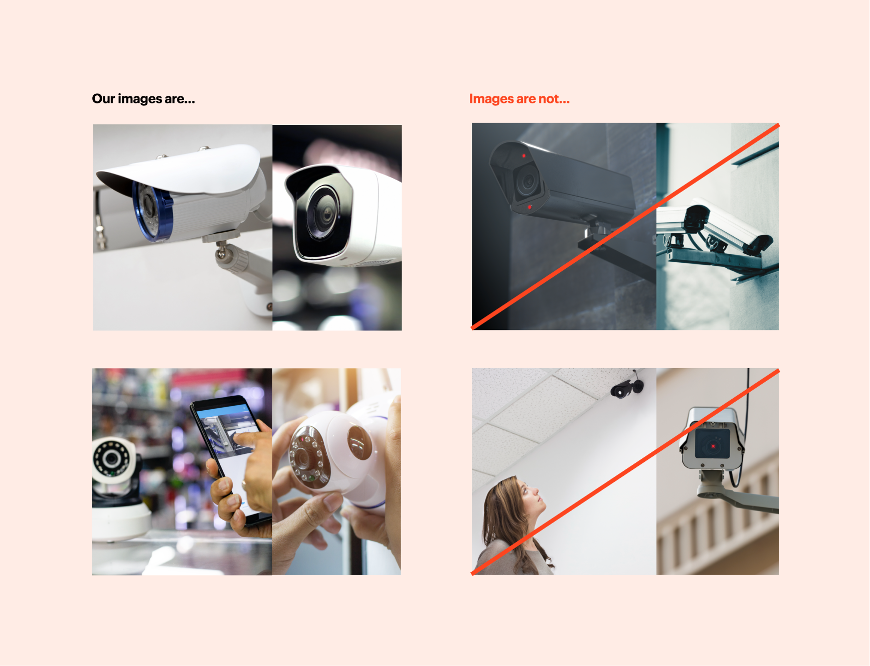
Our photographic images should all feel related, and represent our brand personality. First, images should feel positive and welcoming — but with a focus on professional and cutting-edge tech.



SPATIAL BRANDING
The new branding has been reflected in the spatial design of our new office in the heart of Munich centre. It has won the German Design Award.


TEAM
Jana Frieling — Visual Communication Designer
Paul Anglin — Copywriter & Content Strategist
Other case studies
S&ST Design impactsDesign impacts for launching the platform
Bayern Open Data PlatformFrom complexity to simplicity: Enhancing data uploads for everyone

ArtXCloud Private viewPrivateview turned artwork sharing into a live sales workflow
ArtXCloudReducing friction in artwork onboarding
PliantDesign summary of 2022
S&ST Company websitePowering the next stage of growth
DacadooNew generation of B2B healthcare platform

Porsche e-chargingDesigning interaction for the new e-charging device

QwiccFuture of urban EV charging experience

EquatexNext-gen equity participation platform