CASE STUDY
DACADOO
New generation of B2B healthcare platform
TIMING
Aug 2017 - Feb 2018 — 18 weeks
ROLE
Directing the team and reviewing the outcomes, as well as involved in key meetings and workshops.
OVERVIEW
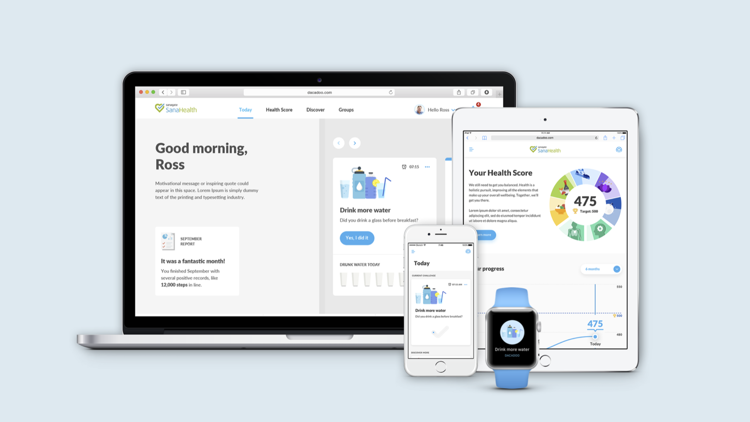
dacadoo is a successful healthcare start-up based in Zurich. They offer a B2B health platform for insurance companies and corporates.
B2B customers love dacadoo platform but their end-users lose interest in using it pretty fast. dacadoo has asked frog to design a new generation of the app.
The goal was to create a level of engagement that will set dacadoo up to become a leading platform provider in the healthcare industry.
WHAT WE DID
• Design research & strategy
• Defining value proposition & target audience
• Designing experience journey and product concept
• Developing a renewed visual design & design system
• Developing tone of the voice & content strategy
• Prototyping & user testing
• Designing for web, mobile and smartwatch
• Tech strategy
• Design documentation
PROCESS
Discovery
Stakeholder interviews
Heuristic analysis
Customer segmentation analysis
Competitive analysis
Technology assessment
Initial ideation
User interviews
Research synthesis
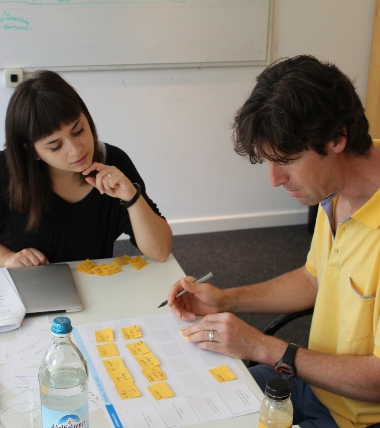
Synthesis workshop
Concept generation
Ideation workshop at dacadoo offsite
Design concept
User testing
Concept iterations
Foundational design
UI design for key flows and key screens
Tone of voice refinement
Messaging framework development
Visual language refinement
Multi-channel experience strategy
Tech strategy
Documentation
BUSINESS IMPACTS

Deeper market penetration

Longer retantion

Corporate wellness proposition
3 BIG TAKE AWAYS
01. Defining value proposition
02. Designing for behavioural change
03. App design
01
Defining value proposition
CHALLENGE
dacadoo owns an algorithm called Health Score which indicates the level of health for individuals. The Health Score proposition resonates with B2B clients but dacadoo struggles with actually getting people to engage with the platform after it’s launched.
A quote from dacadoo's customer brought up a great question — who are we designing for?


RESEARCH
We began with the immersion phase to understand stakeholder needs, both internal and external. Understanding the landscape, in terms of tech, design and business. Empathising people around health and behaviour change as well as testing our initial concepts. Followed by defining a value prop and a target audience.

TARGET AUDIENCE
Based on segmentation analysis, user interviews and desktop research three main personas have been identified.
The primary focus (62,5% of the current users) are people between 40 and 60 years old with low app engagement. They tend to be overweight, with a Health Score below 550, and are fairly inactive. Most of them also have a declining Health Score over time. dacadoo can increase the addressable market to 60% by engaging the primary persona.

BUSINESS
OPPORTUNITY
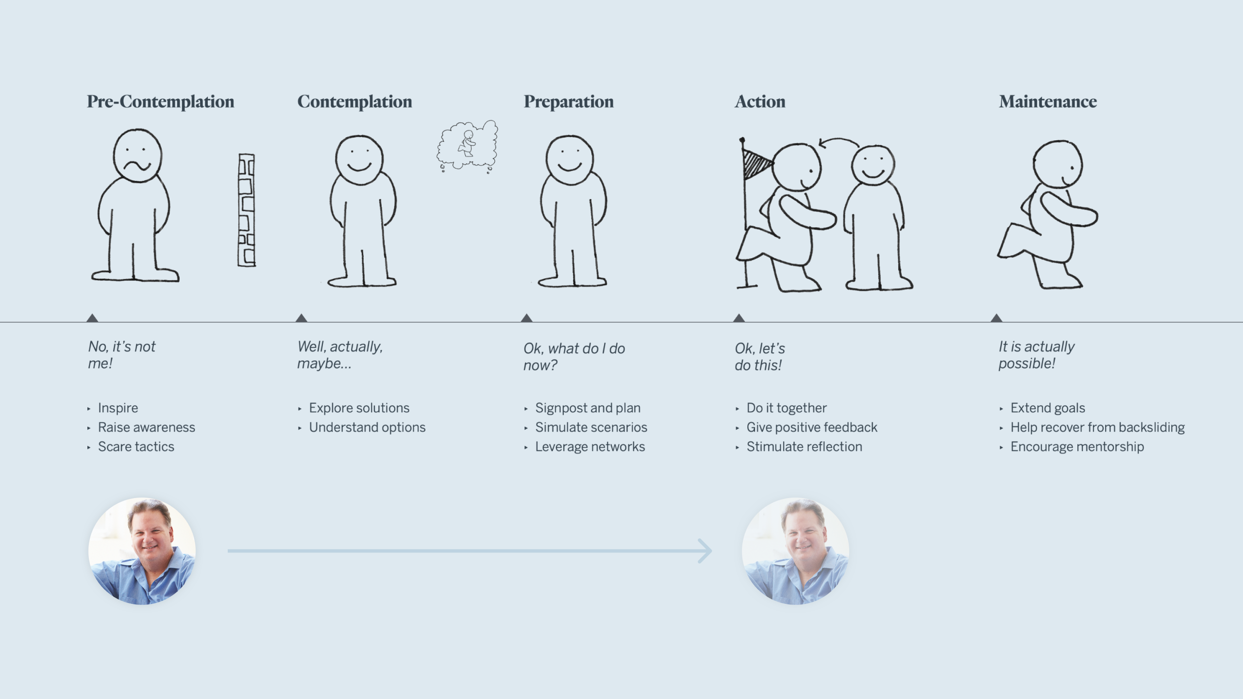
We used the 5 stages of behavioural change model to study where the primary focus group are at and how the dacadoo experience can facilitate the shift.
Taking Ross from pre-contemplation to action would most likely increase his health score. dacadoo has customers with a corresponding contracts model — a financial incentive will be given if dacadoo moves users above 550.

KEY INSIGHTS
The following 3 key insights were distilled from the research. They contributed to form the value proposition and the app design.

Health is very personal
"My health is a personal thing. I don’t find it motivational if I am doing better or not than others. I don’t think it’s any of my business and I don’t consider my colleagues for this kind of thing.”— Tina, during the user interview
While sharing activities and competing with others might be a great motivator for people who are already doing sports, our primal audience would feel rather overwhelming.
dacadoo builds a sense of trust with individual users by taking time to learn more about them and adapting to their choices and actions.

It's better to start small and succeed
“This challenge is too difficult. I’m not motivated enough at this point. Energy is gone. Stress is up… I would want a challenge like ‘Don’t take the elevator for 7 days simple. Keep it simple.” — Florian, during the user interview
The principle of “baby steps” is a well-documented strategy in the world of behaviour change research. Over-committing to too many goals at once means that if you fall behind on one, you feel like you're failing everything.
dacadoo ‘owns’ small, everyday behaviour change, guiding you through bite-size challenges that build your confidence. You can never fail dacadoo.
Self-realisation of progress is the most powerful motivator
“Rewards are a plus, but I wouldn’t do more exercise just to get a ticket to the cinema… It’s a feeling I get out of it. That I really feel better.” — Troy, during the user interview
Extrinsic rewards and gamification strategies can be an effective way to drive initial engagement, but longer-term retention comes from tangible results and the recognition of one’s own progress.
Just like a real coach, dacadoo encourages moments of self-reflection, facilitating educations and celebrating accomplishments.
VALUE PROPOSITION
A strong value proposition and a clear differentiation are critical to drawing users in and keeping them engaged over time.
The real challenge was not only the UX/UI of the app but also the lack of clarity around the purpose and value. As one of the research outcomes, a value proposition was formed together with the dacadoo team.

02
Designing for behavioural change
THE QUESTION
Establishing the trust and credibility necessary to be seen as a health partner takes time, but will lead to longer-term engagement in the end.
So how does dacadoo establish the trust and credibility necessary to be seen as a valuable health partner?
By getting to know the user over time, dacadoo can make recommendations that are truly tailored to who you are and what you want to achieve.
How might we guide Ross from pre-contemplation to action by facilitating behaviour change?
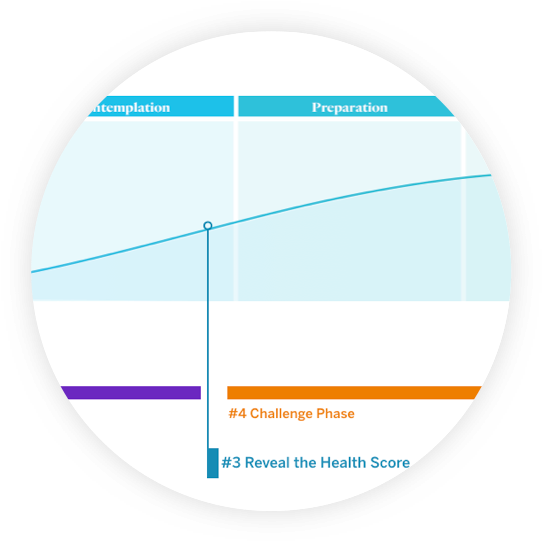
EXPERIENCE JOURNEY
Mapping the journey provides a blueprint for a more focused experience—guiding the user through behaviour change.

#1 — ONBOARDING
Users create accounts and learn the value of dacadoo. As well as establishing a connection to users' underlying motivations.

#2 — ASSESSMENT PHASE
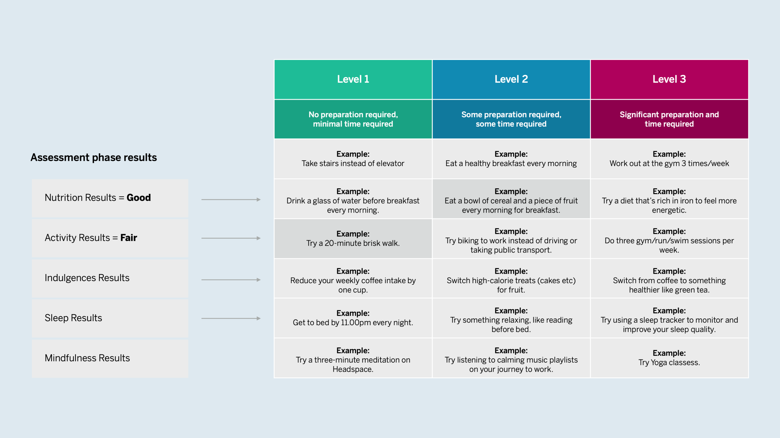
Users build their Health Score by going through a series of fun, self-reflective learning cycles, whilst being educated through key areas of health. Each cycle represents a key area of health.

#3 — REVEALING
THE HEALTH SCORE
Users see their score for the first time, based on what dacadoo learned during the assessment phase. This helps to gain more credibility to the Health Score and emphasise the holistic nature of it.

#4 — CHALLENGE PHASE
The core of the dacadoo experience. and the primary mechanism which users establish new habits and gradually improve their Health Score. User takes on a series of bite-size challenges that are tailored to their health goal—establishing new healthy habits and increasing their self-awareness along the way.
#5 — MAINTENANCE PHASE
Users have established new habits. dacadoo ensures they are maintaining the new healthy behaviours by catching user from back sliding and celebrating achievements.
03
App design
GUIDING PRINCIPLES
One thing at a time
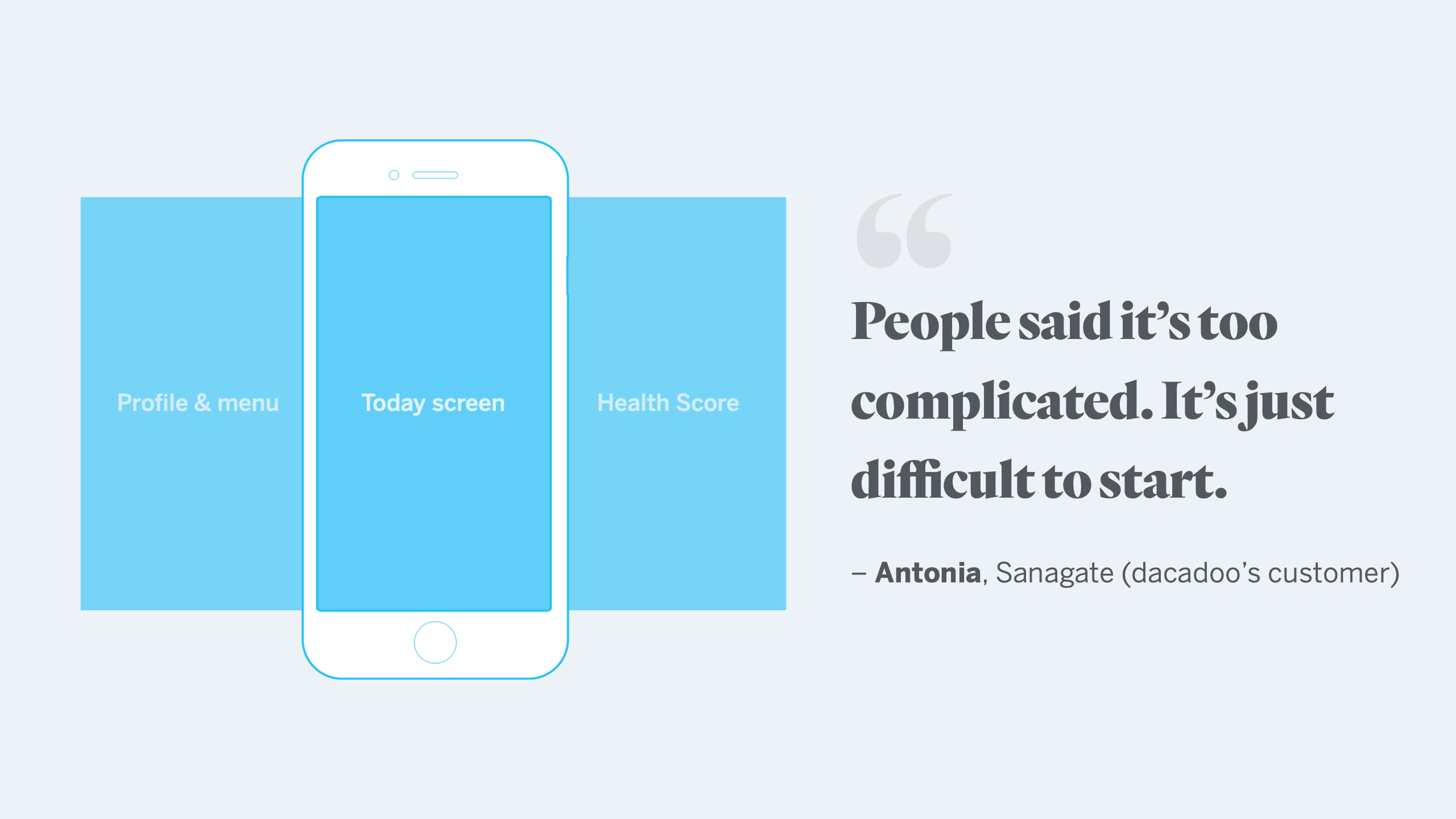
“It’s too complicated. Overwhelming contents and complex structure make me confused and it’s just difficult to start.”
The current app supports a very wide range of health-related functionality. While this holistic approach is one of dacadoo’s key value propositions, it’s also a pain-point for users who feel overwhelmed with so many different features and messages. Creating a mental model that helps the user to focus on the most important thing and simple enough to navigate through the relevant information.
Tangible health score
How accurate is the score? Why did it drop last week? How can I improve it?
The Health Score is a numerical standard that appeals to insurance companies but may be difficult for users to relate with. Users don’t understand what the health score actually means for them or how it can play an actionable role in changing their behaviour.
Right coach at the right time
“My mother came to me and said, ‘Hey I have 200 notifications right now.’ Because she had too many goals and never answered the questions.”
dacadoo’s current virtual coach feature wears many hats and has a lot to say—possibly too much. The right coaching strategy can be incredibly motivating, but users need to feel like the coach is actually talking to them about their needs. Not only should the messages be localized and timed appropriately, but they should also tie health recommendations back to the deeper aspirations in that user’s life.
SIMPLE NAVIGATION
We broke down the previous information architecture and rebuilt a simple yet elegant interaction model.
FOCUS ON TODAY
A flexible, glanceable and always up to date lifestyle navigator: keep the focus on what is relevant now.
The Today screen is one of the most important pieces in the dacadoo experience. This is where users are engaged the most with the app and it is where the coach drives the users' journey through their growth, awareness and action-taking. The goal of “Today” is to keep the focus only on what’s relevant at that moment, providing tailored “next steps”, just like a real coach would do.

INTUITIVE
HEALTH SCORE
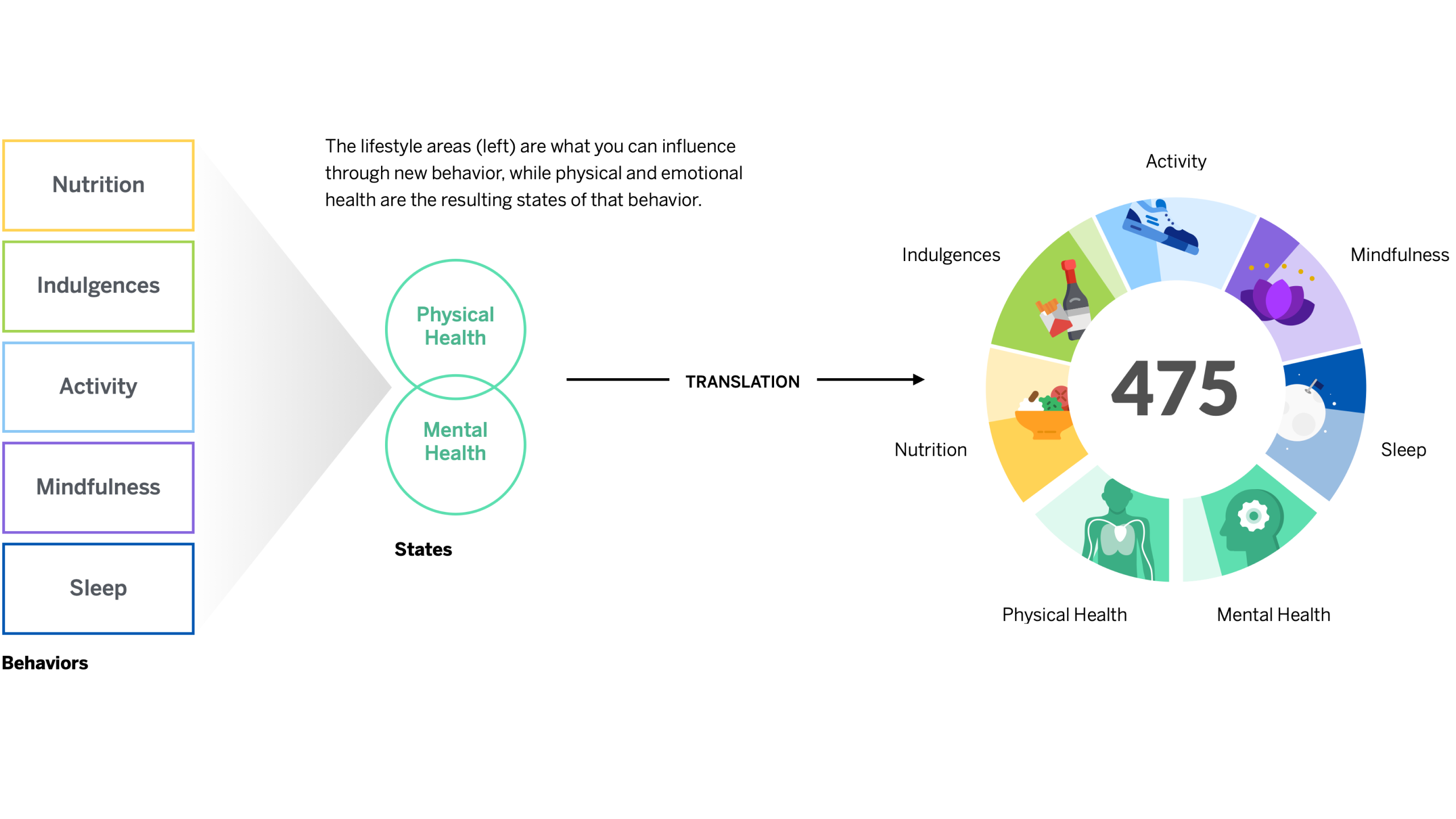
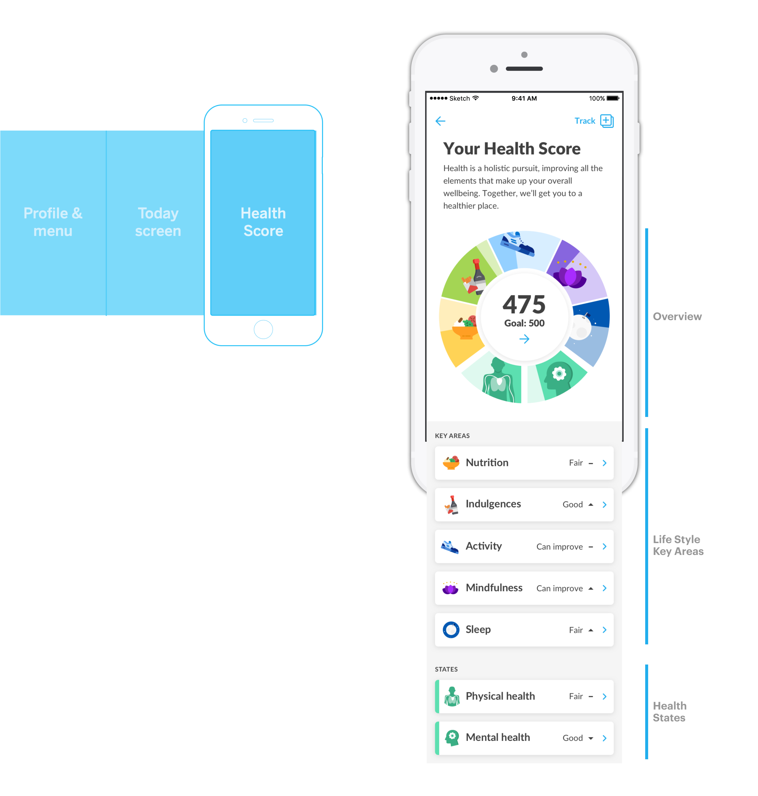
Evaluating the user across the different key areas of health, we made the Health Score much easier to understand by breaking it down from a user perspective.
PROFILE & MENU
Preview of where users are with points and achievements as well as entry points to the sub-components of the app.

THE COACH
The coach — deeply integrated coaching model. The coach should be integrated into every screen of dacadoo and not living on his own, it is a fundamental part of the experience. … knowing, not generic. … contextual, not isolated.… accommodating, not demanding. We designed a series of frameworks to facilitate this experience.



SIGNATURE INTERACTION
Completing the daily task and progressing in the challenge is a very important moment for the user. The act of checking it off should be a fun, satisfying (and maybe slightly addicting) interaction in itself.
Our custom, gesture-based interaction will make the user want to check off their task and give dacadoo another ownable brand element.
dacadoo’s signature moment a subtle, brandable micro-interaction that will give users a moment of delight and satisfaction.
ROBUST & SCALABLE
VISUAL LANGUAGE
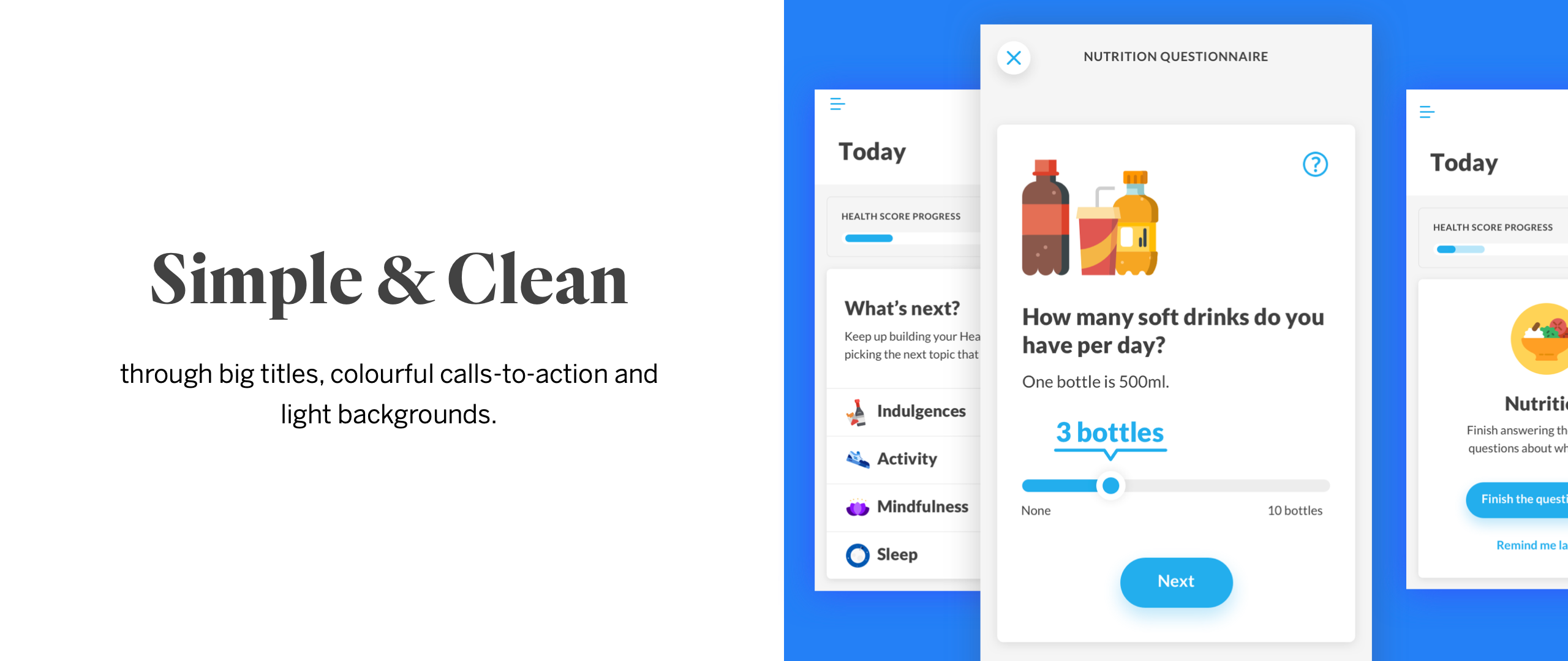
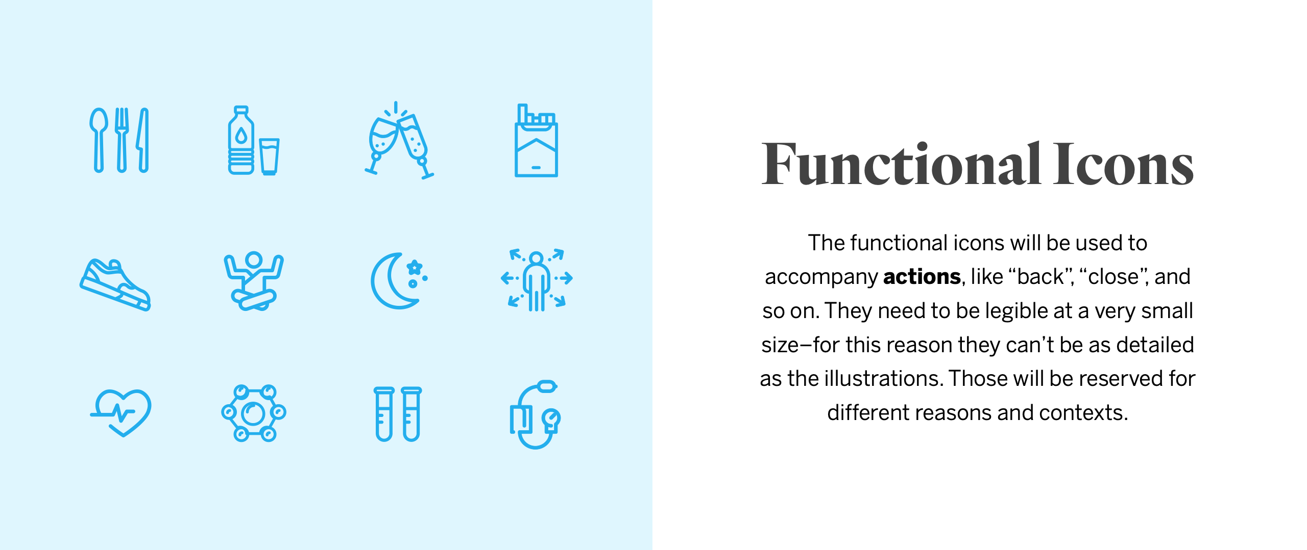
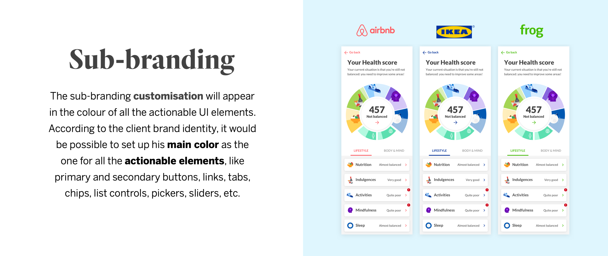
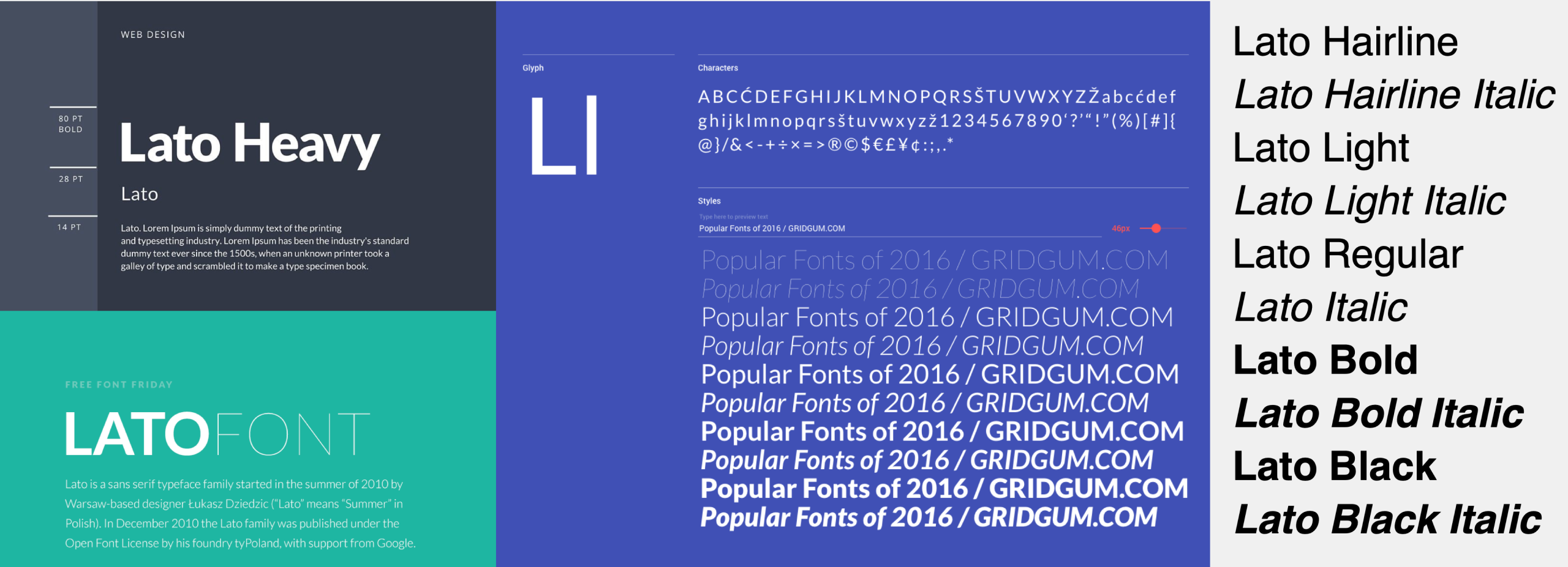
We have established a robust visual language system that caters to a very complex system and data digestions, as well as white-label customisations. Keeping it simple yet a great balance of the warm human touch and professionalism to build credibility. Hints of playfulness are woven into the system when appropriate.






CROSS-PLATFORM
STRATEGY
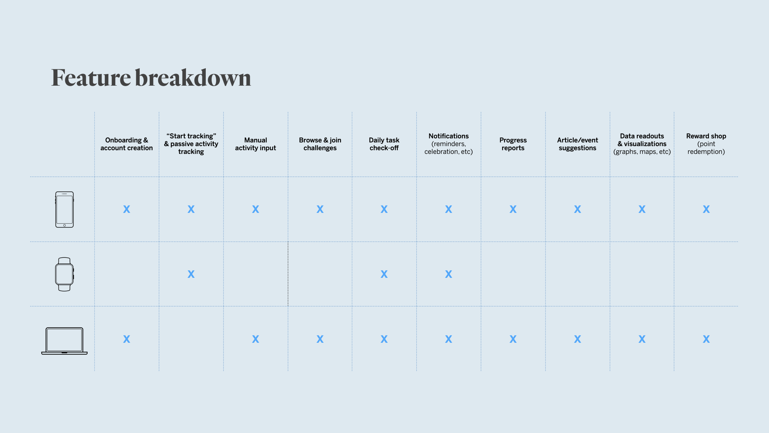
Mobile app
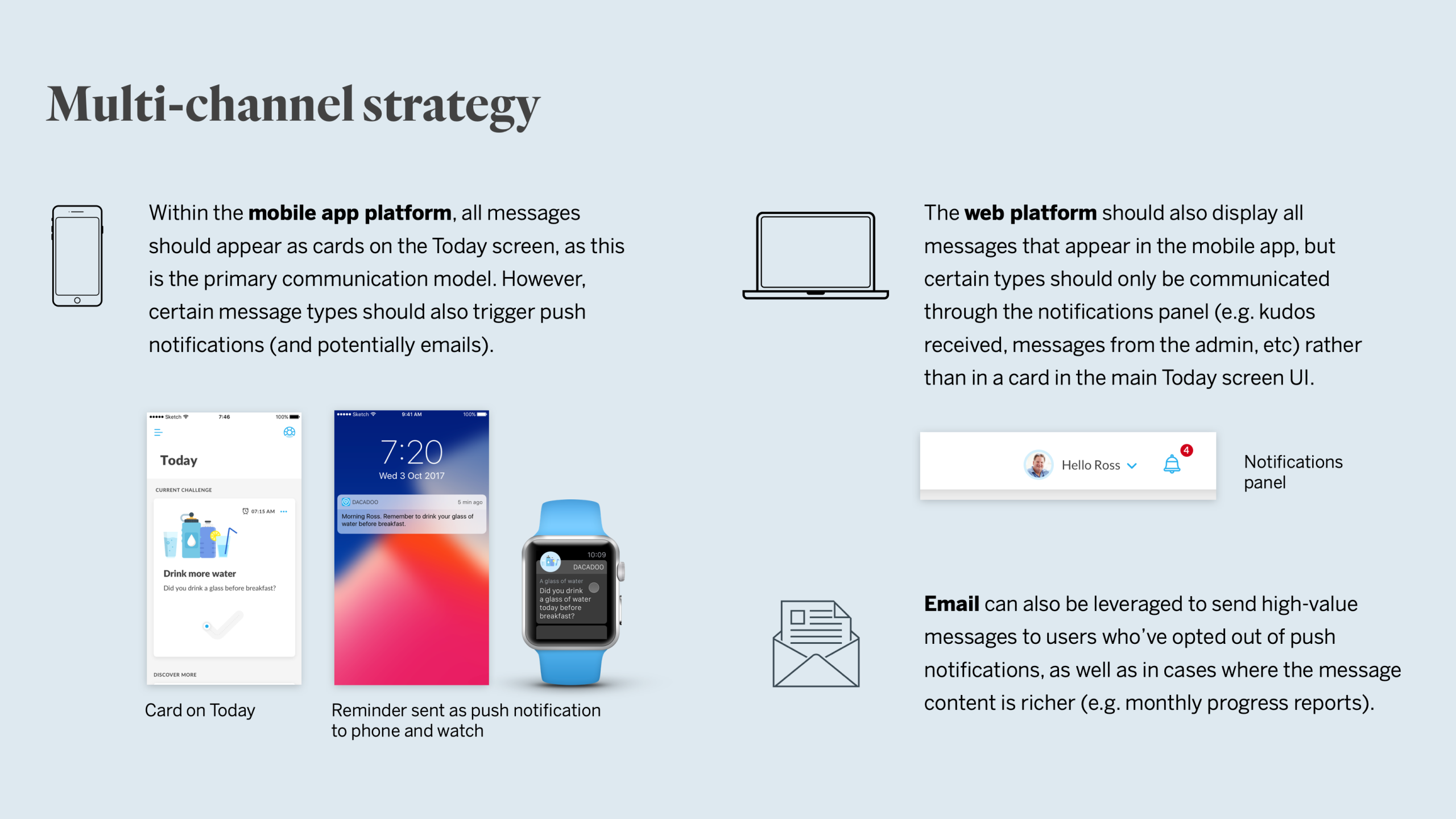
The app should drive the core challenge experience, but it should support all key functionality if the user chooses not to engage with the other platforms.
Smartwatch
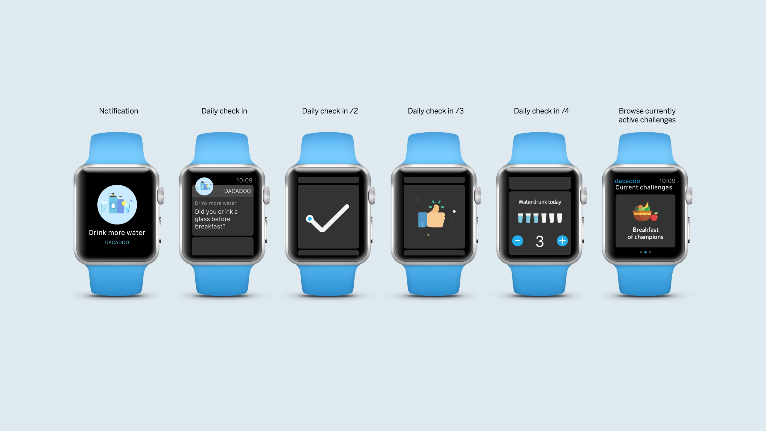
The smartwatch should be leveraged for tracking behaviour (both passively and actively), displaying notifications and facilitating key micro-interactions across the journey.
Responsive web
The web should help contextualize dacadoo within the client’s wellness program. It can also be leveraged for extending data visualizations and resources, and support reward shopping.



CORPORATE
CHALLENGES
Corporate challenges are one-off events set up by organisations. In the new model, we've included a few challenge suggestions that reinforce habit creation by celebrating persistence, instead of just rewarding participants for accomplishing the most of something. These types of challenges are also more inclusive for participants who aren’t very active and would never excel at an activity challenge that rewards total steps or distance (dacadoo's target group).
During our research phase, we found that the majority of users within our target group were resistant to the idea of competing against others, especially people who might be at a different level of physical health. However, groups in which participants are at a similar level and share a common goal have proven to be quite effective.
Social will still play an integral part in the context of corporate challenges. Challenge participants can motivate one another by sending ‘Kudos’ and ‘Boosts’ throughout the challenge
The strategy is to create enthusiasm and to boost engagement during the initial platform launch in organisations.


PROJECT SUMMARY

PERSONAS
ESTABLISHED
_
VALUE PROP
DEFINED
_
EXPERIENCE
JOURNEY MAPPED
_

CORE INTERACTION
CREATED
_

DACADOO EXPOSED
TO DESIGN METHODS
_

VISUAL LANGUAGE
CREATED
_
DESIGN IMPACTS

SIMPLIFIED
NAVIGATION
_
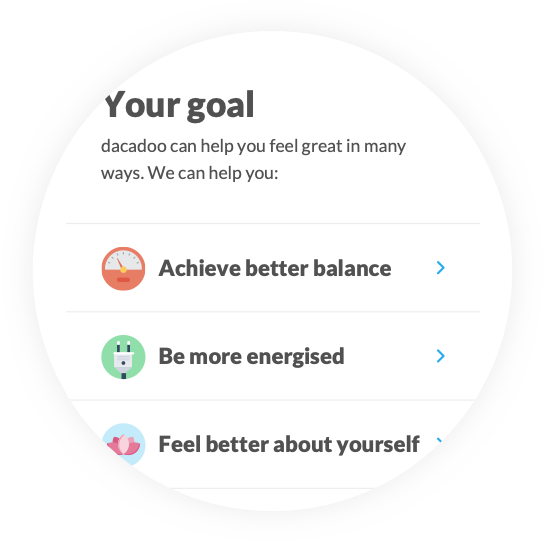
HIGHLY TAILORED
EXPERIENCE
_

FOCUSED DAILY
CHALLENGES
_

CONTEXTUAL
COACHING
_

TANGIBLE
HEALTH SCORE
_

DIFFERENTIATED
VISUAL IDENTITY
_
TEAM
Thomas Sutton — Executive Creative Director
Kim Gladow — Interaction Designer
Aris Dotti — Interaction Designer
Stefania Pizzichi — Visual Designer
Emanuele Di Saverio — Design Technologist
Leonardo Kubrak Maciel — Strategist
Other case studies
S&ST Design impactsDesign impacts for launching the platform
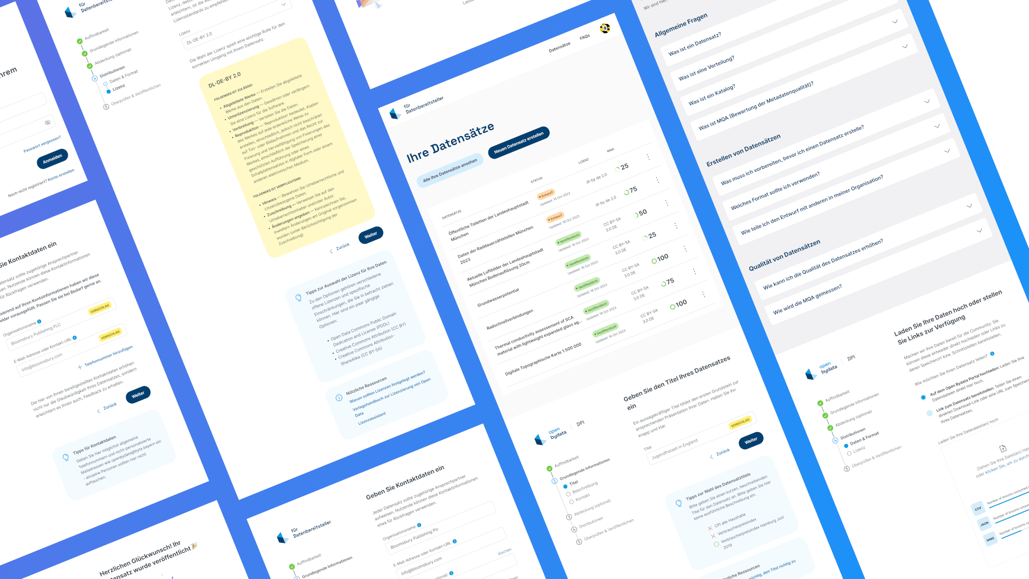
Bayern Open Data PlatformFrom complexity to simplicity: Enhancing data uploads for everyone

ArtXCloud Private viewPrivateview turned artwork sharing into a live sales workflow
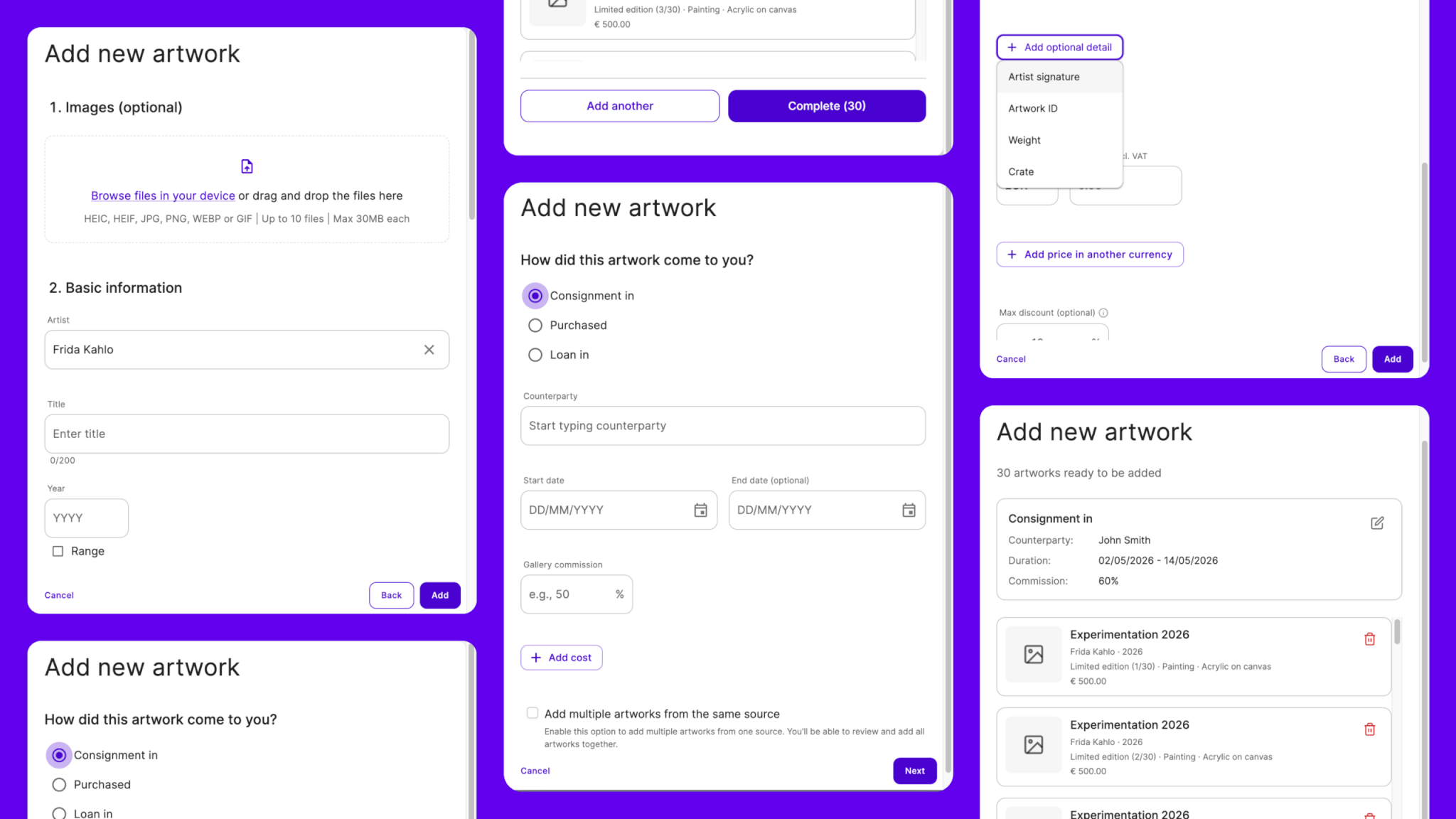
ArtXCloudReducing friction in artwork onboarding
PliantDesign summary of 2022
S&ST Company websitePowering the next stage of growth

S&ST RebrandingGaining the recognition and the trust

Porsche e-chargingDesigning interaction for the new e-charging device

QwiccFuture of urban EV charging experience

EquatexNext-gen equity participation platform